Bookworm
A tablet app to discover new books and community
Overview
ROLE:
UX Designer; team of 5
TIMELINE:
3.5 weeks - 35+ hours
TOOLS USED:
Figma / Canva / Procreate / Trello
Note: This project is a fictitious scenario, completed as a part of UC Berkeley’s Online Extension UX/UI Design Program. The interviews and user testing were all conducted with real people, however.
Problem
In today's digital age, book lovers often find themselves isolated and missing out on the enriching experience of discussing and sharing their reading journeys with others.
Solution
Bookworm is more than just a platform for discovering and sharing books; it's a community hub where readers from all walks of life come together.
view final prototype
Project Goal
Design any high-fidelity prototype, mobile application, website, etc.
01 / Empathize - User Research
Research Objectives
How do people find and read their books?
What qualifies as a trusted source for book recommendations - what criteria do you check before you decide what to buy?
Is there a strong user need for a community in reading?
Survey Findings
Our research uncovered some surprising insights. Initially, my team member who came up with the idea did so because they had an overwhelming experience while trying to buy a book, but our interviews showed that many people actually prefer, even cherish, the experience of browsing in bookstores. This emphasized the importance of grounding our concept in user feedback.
Top Takeaways
People prefer to find books via the experience of browsing in a bookstore
Trusted sources for book recommendations are friends, family members, social media communities; ie people with shared interests
There is a strong user need for community in reading, but book clubs are challenging to keep up in their experience

Affinity Diagram
To organize the responses and identify any recurring themes or pain points, we created an Affinity Diagram.
Affinity Diagram Highlights


Overview
Research Approach
Survey Findings
Research Approach
Our team decided to conduct five user interviews, and each team member would be responsible for one; we were aiming to assess current pain points and opportunities for the book selection/community experience, and whether there is a need for help with forming or discovering ways to discuss books.
Research Problem
Understand how users currently obtain books, discuss books, and if there is any interest in having more of a community around books.


03 / Ideate - Create the Framework
Overview
Ideation
Storyboarding
Sitemap
User Flow
Ideation
To expand on our thought process and keeping our opportunities of connection, engagement, and community in mind, our group completed a round of ideation using the “I like, I Wish, What If?” method.

From here, we organized our ideas into a Feature Prioritization Matrix, paying special attention to the ideas that met at an appropriate cross-section of complexity and impact.

Created using Figjam
Through this round of ideation, we decided that the primary navigation should contain the app's Home feed, Book Clubs, Book Recommendations/Discover, and User Profile.


Storyboarding
When it came to storyboarding, I got a little creative, and, using Procreate, I thought up Theo, the Space Cat, a character who I thought would be an ideal user of Bookworm.

Sitemap
Two of our team members began to work on our user flow, then soon realized the layout of our app was more complex than we originally thought. To work through this and get on the same page about our information architecture, one of my team members and I created a sitemap.
First, we created our footer navigation: 4 tabs and a "+" symbol to post new content
Home
Browse books
Find groups
Profile
"+" icon
We also created a hamburger menu in the upper left corner
Notifications
Joined
Library
Saves

User Flow
Initial User Flow
Our initial user flow walks the user through the home page, which features content they have opted to follow, to the community tab to view personal discussion posts and the communities the user belongs to, then to the book club tab, where the user can view the book clubs they have joined or search for new ones to join. Finally, the user can navigate through the search/discovery tab to search for new types of books.

04 / Prototype - From Paper Sketches to Figma
Overview
Wireframes
UI Style Guide and Branding
Wireframes
With our features identified and our User Flow established, our group was ready to start our wireframes, starting with "paper" sketches. These sketches represented each of our identified features related to our user needs of community and discussion around books, as well as the ability to search for and discover new books, demonstrated through our home, browse books/search, book club/communities, and user profile tabs.
“Paper” Sketch Wireframes
My Wireframes


Team member #1's Wireframes

Team member #2's Wireframes


Team member's #3's Wireframes


Team member #4's Wireframes


After each member finished our initial sketches, we compared and talked through our thought processes, then discussed which elements we would like to pull from each member's sketches to move forward. Our group decided to jump from paper sketches to mid-fidelity wireframes, which may have contributed to some of the issues we would run into in our next round of iterations, which I will further explain below.
Mid-Fidelity Wireframes
view mid-fidelity prototype
UI Style Guide and Branding
While we worked on our wireframes, two other team members and I also began to think about our styling and branding for Bookworm. One team member took the liberty of choosing our color palette, then named each color to make them more personal to the Bookworm brand, focusing on various hues of gray, green, and brown.
Our aim for our styling and branding was to create an app that felt cozy, approachable, and familiar, aiming to replicate the feel of browsing through a book store or library. The fonts we chose, Mate SC and Raleway, offer a nice balance of a Serif bold with a Sans Serif rounder, more approachable font.
My team members created virtual "bookshelves" that the user can scroll and search through, and displays as if it's a real bookshelf. Each user can also view the different genres they're interested in on their profile, displayed by our "genre flags" or bookmarks.
Style Tile
For our color palette, we kept the coral, pale yellow, and dark blue colors from the previous website as more secondary colors, and brought in newer, cooler colors like Periwinkle and Lavender that would feel welcoming to the user. We also chose to incorporate a gradient in the background of each page, a subtle but effective way for the page to maintain its unique eclectic feel.
To keep the spirit of the "Bubblegum Pop" font, we found a similar looking font that was more filled in and easier to read called "Gloomie Saturday", which we used to replace the headings on the website. For the body text, we chose varying sizes of Montserrat, an approachable looking Sans Serif font. We also kept HHA's original font in our redesign on their About page to maintain some of the original design.
Final Style Guide

During this round of iterations, one team member was out of town and unable to work on the wireframes, so the remaining team members and I split up the work to do each section of Bookworm: the home feed, the browse books/search tab, the communities and book clubs tab, and the user profile tab.
Home page
We divided our home tab into three different pages, which the user can choose from the top navigation bar: The Post (content based on the content the user has chosen to follow), My Circle (content from the communities and book clubs the user is a part of), and H.O.T.P., or Hot Off the Presses (new book recommendations based on users' previous activity). We wanted to name this tab something more unique, trying to distinguish it from the feel of a traditional social media type app.


Browse Books/Search
We wanted to give user a wider range of options to search for a book, similar to the experience of looking for a book in a bookstore, so we included the categories of genre, "journeys", as in common book tropes, moods, and more.

Book Clubs/Communities Home
Users can choose to join communities, which are more similar to a discussion forum for topics that could involve books, but could also concern more broad topics around books, such as specific authors, genres, or book trends. Users can also join book clubs, which are specific groups of people who discuss specific books on the same schedule.

User Profile
On users' profiles, they can add to their personal library, made up of various "bookshelves" that the user can personally name. Users are able to search through their different bookshelves and see every book within each bookshelf (shown in the right picture below).


Conclusion and Takeaways
Beware of Featuritis - it's more likely than you think!
Our group had a lot of great ideas, therefore many opportunities to recognize what was absolutely necessary, and what was not.
Communicate, Iterate, Delegate!
It takes a lot to make sure the work gets done in a way that is organized AND accurately represents each member of the group.
It always comes back to the user research and testing (if you want to make the best app possible!)
Even in the most stressful parts of the project, we stayed on track by relying on our existing research and test results, and trusting that feedback ultimately led us to a successful project!
Have any thoughts or questions about this project?
Let’s discuss!
contact me
Have any thoughts or questions about this project?
Let’s discuss!
contact me
02 / Define - Synthesis
Overview
Persona Development
User Insight
Problem Statement
Competitor Analysis
Persona Development
The discoveries our team made from our interview participants proved that there were opportunities for user's experiences with finding and discussing books.
All of our interviewees agreed that they have a desire for a community around their shared interest of books, but that traditional book clubs are difficult to maintain due to time commitment or scheduling issues.
From these identified opportunities, we were able to put together our User Persona., Ruby Phillips.
Ruby thrives on uncovering hidden patterns and insights from her cozy home office. She's a bit of a nerd at heart, passionate about books, numbers, and all things data. Working from home can get lonely, so Ruby is on the lookout for a vibrant community of fellow book lovers and knowledge seekers. She loves sharing her thoughts and engaging in meaningful conversations and seeing new perspectives and knowledge.

Competitor Analysis
Two of my group members handled the task of our competitor analysis using a SWOT analysis. They started with three existing book apps, Fable, GoodReads, and Bookum, acting as direct competitors.


They also looked at Reddit and Discord, since they are both discussion platforms, built on communities and channels dedicated to certain attributes or interests, serving as our indirect competitors.


We identified several areas where these competitors missed opportunities, such as having clunky and cluttered UI, difficulties with discoverability, a lack of specific genres, and recommendations that fall short.
Although there is an abundance of online platforms, we felt that we didn't find a dedicated space where readers can:
Conveniently come together to form genuine communities,
Engage in meaningful and intentional discussions, and
Receive personalized book recommendations,
leaving readers feeling disconnected and struggling to find books that truly align with their interests and preferences.
User Insight
Users need a community where they can easily become and stay engaged in discussion groups and book clubs because users feel a strong desire to socialize around reading, but find that book clubs they've participated in previously fell apart frequently.
Problem Statement
In today's digital age, book lovers often find themselves isolated and missing out on the enriching experience of discussing and sharing their reading journeys with others. Despite the vast number of online platforms, there is a lack of dedicated spaces where readers can conventiently come together to form genuine communities, engage in meaningfulintentional discussions, and receive personalized book recommendations. This gap leaves readers feeling disconnected and struggling to discover books that truly resonate with their interests and preferences.
Our app aims to bridge this gap by creating a vibrant/cozy platform that connects readers, allows for engaging book discussions, and builds a supportive community, by connecting users reading preferences and habits with their communication and social media preferences to enhance the reading experience. Through interactive features, users can join book clubs, share insights, and even make their own bookshelf/library in their public profile.
Value Proposition Statement
Our app offers book lovers a convenient, low-stakes platform to connect, engage in meaningful discussions, and build a supportive community. By providing personalized book recommendations and the ability to participate from anywhere, we tranform solitary reading into a shared journey of discovery and growth.
Experience the joy of reading together, without the high commitments of traditional book clubs.
05 / Test - Test, Revise, Repeat
Overview
Mid-fidelity Prototype Tests
A/B Tests for Mid to High-Fidelity
Applying Revisions
High-fidelity Prototype - Final Design
Next Steps
Conclusion and takeaways
Mid-Fidelity Prototype Tests
Once we had these wireframes completed, we conducted a round of user testing, and I took the liberty of writing the user test plan.
Research Objective
Identify pain points associated with navigating Bookworm. Understand if users find the app efficient and intuitive.
Target Users
Avid book lovers interested in the discussion and discovery of the world of books.
Questions We Want Answered
Is Bookworm's navigation intuitive?
Are our features usable?
How do users feel while using Bookworm?
Are users able to navigate our footer navigation successfully?
Tasks
Browse sections of home page
See personal Bookshelves on Profile
Browse a Book Club and a Community Page
Browse for books under "Discover Books" tab
A/B Tests for Mid to High-Fidelity
During our first round of testing, it became very apparent that these wireframes, designed by four different people, resulting in four different design styles and making our app look very disconnected. In between our mid and high-fidelity prototype. Because of this, we had to take a step back, make a new plan, and conduct our next round of user testing to confidently move forward with the rest of our design decisions. We delegated the rest of the styling to only 3 group members, and the remaining group members split up the remaining tasks and helped with the wireframing/prototyping as needed.
We aked users to compare designs and layouts for our Communities and Book Club tabs, our "Communities" page layout, and the design of our "Mood" filter on our Browse Books page.
Community and Book Club Tabs


Communities Page Layout
Mood filter options

Results and Suggestions
Users preferred the second layout option for the Communities and Book Club tab
Users preferred the lighter color scheme for the Communities page
Users preferred the checkbox option versus the slider option for the Mood filter
Applying Revisions
Our testing proved to be very helpful to tighten up our design and work together to finish strong.
Created consistency in:
Typography
Card sizing
Color scheme
Grid system
Tab titles
Created additional pages to make user flow more intuitive, including:
Additional "Mood" selection page between browse and final results page
Expanded community reviews on book description page
Additional "See all reviews" page
Final Design


view final prototype
Mid-Fidelity Prototype
In addition to applying the revisions from our user tests on our to mid to high-fidelity prototype, our group updated our overall user flow in this last round of revision. We also created a more detailed flow for the extensiveness of our discover books section, as well as our communities and book clubs section under our Find Groups tab. With this flow the user can see how each feature connects back to other features, and shows how writing a review can connect to search, to their profile, and more.
Final User Flow, part 1
Final User Flow, part 2

Home page
Because Bookworm was designed to help users discover books and community, the user lands on a "For You" page, filled with posts recommended for them that they don't already follow.

"My Circle" shows recent updates from people, clubs, and genres the user follows.

After receiving the feedback about our "H.O.T.P." page, we decided to rename the page to "Trending" to simplify the design and make it more intuitive for the user. This page shows new releases or books and quotes that are popular across all users.

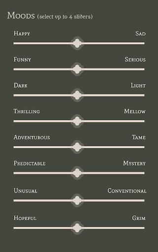
Our "Discover Books" tab is meant to replicate the treasure hunting vibe of browsing through a bookstore, and gives users several options for how to browse: there are "Journeys" aka narrative arcs if the user is looking for a certain type of storytelling, curated reading lists, which are highlights of books that users' friends are reading, and more typical browsing styles, like by author or genre. Users can also search by mood, selecting as many different moods as desired that the user would like to feel while reading. If they click "Find Books", the user gets a list of books that fits the selected filters.


Users can click on individual booksto see more details, including a summary, the genres the book fits into, average of ratings across all users or individual user reviews, and even which clubs and communities are currently discussing it.


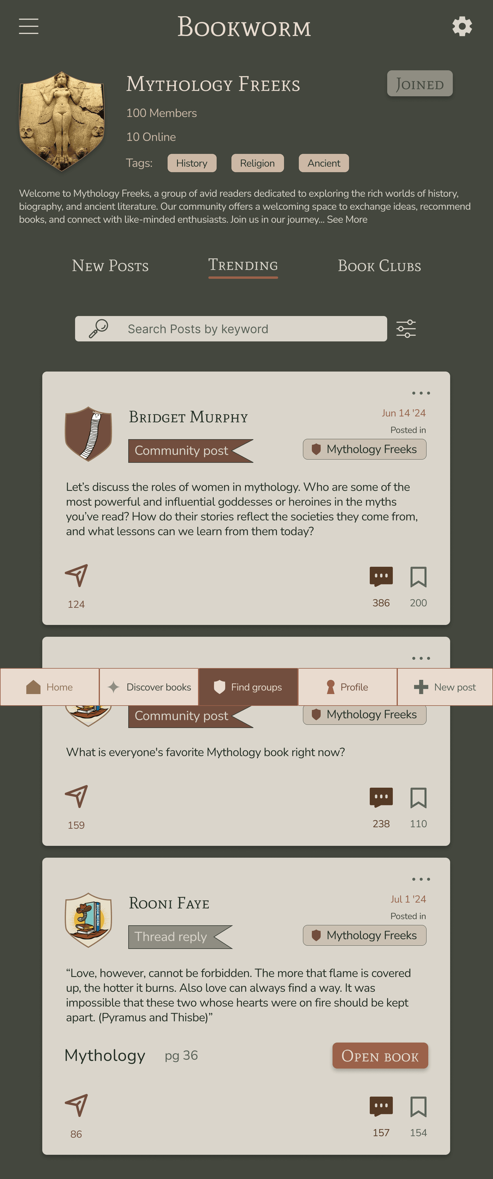
When users click on the Find Groups tab, they first land on the communities page. They can also browse Book clubs by pressing on the tab name. Both tabs give users a preview of what genres the group is centered around, as well as what books were recently discussed in the community. In each community page, users can see an overview of the community, including their newest posts, Trending (top trending posts within this group), and Book Clubs (all book clubs that live under that community).


When users click into a book club, they can see an overview, including current, past, and future reads, discussoins that have happened within the book club, and when past or future book club events are scheduled for, to give users a sense of whether the club will fit their interests and schedule.


Under the Profile tab, users can see which genres they've chosen to highlight on their profile page, bookshelves they've curated, reviews they've submitted, and other posts they've made.


The final tab on the footer navigation, a plus sign, allows for users to quickly create a new post or review. When clicked, users can choose their posting option, then share instantly to their desired feed.


If we had more time, we would...
Research the best method of measuring engagement for the "non"-social media experience we want to curate
Customizable video chat UI for book clubs
Dark and light mode
Gamification of setting themes for your bookshelf, etc.
Create onboarding process
Setting user interest/content preferences
Bookworm
A tablet app to discover new books and community
Overview
ROLE:
UX Designer; team of 5
TIMELINE:
3.5 weeks - 35+ hours
TOOLS USED:
Figma / Canva / Procreate / Trello
Note: This project is a fictitious scenario, completed as a part of UC Berkeley’s Online Extension UX/UI Design Program. The interviews and user testing were all conducted with real people, however.
Problem
In today's digital age, book lovers often find themselves isolated and missing out on the enriching experience of discussing and sharing their reading journeys with others.
Solution
Bookworm is more than just a platform for discovering and sharing books; it's a community hub where readers from all walks of life come together.
view final prototype
Project Goal
Design any high-fidelity prototype, mobile application, website, etc.
01 / Empathize - User Research
Overview
Research Approach
Survey Findings
Research Approach
Our team decided to conduct five user interviews, and each team member would be responsible for one; we were aiming to assess current pain points and opportunities for the book selection/community experience, and whether there is a need for help with forming or discovering ways to discuss books.
Research Problem
Understand how users currently obtain books, discuss books, and if there is any interest in having more of a community around books.
Research Objectives
How do people find and read their books?
What qualifies as a trusted source for book recommendations - what criteria do you check before you decide what to buy?
Is there a strong user need for a community in reading?
Survey Findings
Our research uncovered some surprising insights. Initially, my team member who came up with the idea did so because they had an overwhelming experience while trying to buy a book, but our interviews showed that many people actually prefer, even cherish, the experience of browsing in bookstores. This emphasized the importance of grounding our concept in user feedback.
Affinity Diagram
To organize the responses and identify any recurring themes or pain points, we created an Affinity Diagram.
Affinity Diagram Highlights
Top Takeaways
People prefer to find books via the experience of browsing in a bookstore
Trusted sources for book recommendations are friends, family members, social media communities; ie people with shared interests
There is a strong user need for community in reading, but book clubs are challenging to keep up in their experience
02 / Define - Synthesis
Overview
Persona Development
User Insight
Problem Statement
Competitor Analysis
Persona Development
The discoveries our team made from our interview participants proved that there were opportunities for user's experiences with finding and discussing books.
All of our interviewees agreed that they have a desire for a community around their shared interest of books, but that traditional book clubs are difficult to maintain due to time commitment or scheduling issues.
From these identified opportunities, we were able to put together our User Persona., Ruby Phillips.
Ruby thrives on uncovering hidden patterns and insights from her cozy home office. She's a bit of a nerd at heart, passionate about books, numbers, and all things data. Working from home can get lonely, so Ruby is on the lookout for a vibrant community of fellow book lovers and knowledge seekers. She loves sharing her thoughts and engaging in meaningful conversations and seeing new perspectives and knowledge.
Competitor Analysis
Two of my group members handled the task of our competitor analysis using a SWOT analysis. They started with three existing book apps, Fable, GoodReads, and Bookum, acting as direct competitors.
They also looked at Reddit and Discord, since they are both discussion platforms, built on communities and channels dedicated to certain attributes or interests, serving as our indirect competitors.
We identified several areas where these competitors missed opportunities, such as having clunky and cluttered UI, difficulties with discoverability, a lack of specific genres, and recommendations that fall short.
Although there is an abundance of online platforms, we felt that we didn't find a dedicated space where readers can:
Conveniently come together to form genuine communities,
Engage in meaningful and intentional discussions, and
Receive personalized book recommendations,
leaving readers feeling disconnected and struggling to find books that truly align with their interests and preferences.
User Insight
Users need a community where they can easily become and stay engaged in discussion groups and book clubs because users feel a strong desire to socialize around reading, but find that book clubs they've participated in previously fell apart frequently.
Problem Statement
In today's digital age, book lovers often find themselves isolated and missing out on the enriching experience of discussing and sharing their reading journeys with others. Despite the vast number of online platforms, there is a lack of dedicated spaces where readers can conventiently come together to form genuine communities, engage in meaningfulintentional discussions, and receive personalized book recommendations. This gap leaves readers feeling disconnected and struggling to discover books that truly resonate with their interests and preferences.
Our app aims to bridge this gap by creating a vibrant/cozy platform that connects readers, allows for engaging book discussions, and builds a supportive community, by connecting users reading preferences and habits with their communication and social media preferences to enhance the reading experience. Through interactive features, users can join book clubs, share insights, and even make their own bookshelf/library in their public profile.
Value Proposition Statement
Our app offers book lovers a convenient, low-stakes platform to connect, engage in meaningful discussions, and build a supportive community. By providing personalized book recommendations and the ability to participate from anywhere, we tranform solitary reading into a shared journey of discovery and growth.
Experience the joy of reading together, without the high commitments of traditional book clubs.
03 / Ideate - Create the Framework
Overview
Ideation
Storyboarding
Sitemap
User Flow
Ideation
To expand on our thought process and keeping our opportunities of connection, engagement, and community in mind, our group completed a round of ideation using the “I like, I Wish, What If?” method.
From here, we organized our ideas into a Feature Prioritization Matrix, paying special attention to the ideas that met at an appropriate cross-section of complexity and impact.
Created using Figjam
Through this round of ideation, we decided that the primary navigation should contain the app's Home feed, Book Clubs, Book Recommendations/Discover, and User Profile.
Storyboarding
When it came to storyboarding, I got a little creative, and, using Procreate, I thought up Theo, the Space Cat, a character who I thought would be an ideal user of Bookworm.
Sitemap
Two of our team members began to work on our user flow, then soon realized the layout of our app was more complex than we originally thought. To work through this and get on the same page about our information architecture, one of my team members and I created a sitemap.
First, we created our footer navigation: 4 tabs and a "+" symbol to post new content
Home
Browse books
Find groups
Profile
"+" icon
We also created a hamburger menu in the upper left corner
Notifications
Joined
Library
Saves
User Flow
Initial User Flow
Our initial user flow walks the user through the home page, which features content they have opted to follow, to the community tab to view personal discussion posts and the communities the user belongs to, then to the book club tab, where the user can view the book clubs they have joined or search for new ones to join. Finally, the user can navigate through the search/discovery tab to search for new types of books.
04 / Prototype - From Paper Sketches to Figma
Overview
Wireframes
UI Style Guide and Branding
Wireframes
With our features identified and our User Flow established, our group was ready to start our wireframes, starting with "paper" sketches. These sketches represented each of our identified features related to our user needs of community and discussion around books, as well as the ability to search for and discover new books, demonstrated through our home, browse books/search, book club/communities, and user profile tabs.
“Paper” Sketch Wireframes
My Wireframes
Team member #1's Wireframes
Team member #2's Wireframes
Team member's #3's Wireframes
Team member #4's Wireframes
After each member finished our initial sketches, we compared and talked through our thought processes, then discussed which elements we would like to pull from each member's sketches to move forward. Our group decided to jump from paper sketches to mid-fidelity wireframes, which may have contributed to some of the issues we would run into in our next round of iterations, which I will further explain below.
During this round of iterations, one team member was out of town and unable to work on the wireframes, so the remaining team members and I split up the work to do each section of Bookworm: the home feed, the browse books/search tab, the communities and book clubs tab, and the user profile tab.
Home page
We divided our home tab into three different pages, which the user can choose from the top navigation bar: The Post (content based on the content the user has chosen to follow), My Circle (content from the communities and book clubs the user is a part of), and H.O.T.P., or Hot Off the Presses (new book recommendations based on users' previous activity). We wanted to name this tab something more unique, trying to distinguish it from the feel of a traditional social media type app.
Browse Books/Search
We wanted to give user a wider range of options to search for a book, similar to the experience of looking for a book in a bookstore, so we included the categories of genre, "journeys", as in common book tropes, moods, and more.
Book Clubs/Communities Home
Users can choose to join communities, which are more similar to a discussion forum for topics that could involve books, but could also concern more broad topics around books, such as specific authors, genres, or book trends. Users can also join book clubs, which are specific groups of people who discuss specific books on the same schedule.
User Profile
On users' profiles, they can add to their personal library, made up of various "bookshelves" that the user can personally name. Users are able to search through their different bookshelves and see every book within each bookshelf (shown in the right picture below).
Mid-Fidelity Wireframes
view mid-fidelity prototype
view mid-fidelity prototype
UI Style Guide and Branding
While we worked on our wireframes, two other team members and I also began to think about our styling and branding for Bookworm. One team member took the liberty of choosing our color palette, then named each color to make them more personal to the Bookworm brand, focusing on various hues of gray, green, and brown.
Our aim for our styling and branding was to create an app that felt cozy, approachable, and familiar, aiming to replicate the feel of browsing through a book store or library. The fonts we chose, Mate SC and Raleway, offer a nice balance of a Serif bold with a Sans Serif rounder, more approachable font.
My team members created virtual "bookshelves" that the user can scroll and search through, and displays as if it's a real bookshelf. Each user can also view the different genres they're interested in on their profile, displayed by our "genre flags" or bookmarks.
Style Tile
For our color palette, we kept the coral, pale yellow, and dark blue colors from the previous website as more secondary colors, and brought in newer, cooler colors like Periwinkle and Lavender that would feel welcoming to the user. We also chose to incorporate a gradient in the background of each page, a subtle but effective way for the page to maintain its unique eclectic feel.
To keep the spirit of the "Bubblegum Pop" font, we found a similar looking font that was more filled in and easier to read called "Gloomie Saturday", which we used to replace the headings on the website. For the body text, we chose varying sizes of Montserrat, an approachable looking Sans Serif font. We also kept HHA's original font in our redesign on their About page to maintain some of the original design.
Final Style Guide
05 / Test - Test, Revise, Repeat
Overview
Mid-fidelity Prototype Tests
A/B Tests for Mid to High-Fidelity
Applying Revisions
High-fidelity Prototype - Final Design
Next Steps
Conclusion and takeaways
Mid-Fidelity Prototype Tests
Once we had these wireframes completed, we conducted a round of user testing, and I took the liberty of writing the user test plan.
Research Objective
Identify pain points associated with navigating Bookworm. Understand if users find the app efficient and intuitive.
Target Users
Avid book lovers interested in the discussion and discovery of the world of books.
Questions We Want Answered
Is Bookworm's navigation intuitive?
Are our features usable?
How do users feel while using Bookworm?
Are users able to navigate our footer navigation successfully?
Tasks
Browse sections of home page
See personal Bookshelves on Profile
Browse a Book Club and a Community Page
Browse for books under "Discover Books" tab
A/B Tests for Mid to High-Fidelity
During our first round of testing, it became very apparent that these wireframes, designed by four different people, resulting in four different design styles and making our app look very disconnected. In between our mid and high-fidelity prototype. Because of this, we had to take a step back, make a new plan, and conduct our next round of user testing to confidently move forward with the rest of our design decisions. We delegated the rest of the styling to only 3 group members, and the remaining group members split up the remaining tasks and helped with the wireframing/prototyping as needed.
We aked users to compare designs and layouts for our Communities and Book Club tabs, our "Communities" page layout, and the design of our "Mood" filter on our Browse Books page.
Community and Book Club Tabs
Communities Page Layout
Mood filter options
Results and Suggestions
Users preferred the second layout option for the Communities and Book Club tab
Users preferred the lighter color scheme for the Communities page
Users preferred the checkbox option versus the slider option for the Mood filter
Applying Revisions
Our testing proved to be very helpful to tighten up our design and work together to finish strong.
Created consistency in:
Typography
Card sizing
Color scheme
Grid system
Tab titles
Created additional pages to make user flow more intuitive, including:
Additional "Mood" selection page between browse and final results page
Expanded community reviews on book description page
Additional "See all reviews" page
Final Design
view final prototype
view final prototype
Mid-Fidelity Prototype
In addition to applying the revisions from our user tests on our to mid to high-fidelity prototype, our group updated our overall user flow in this last round of revision. We also created a more detailed flow for the extensiveness of our discover books section, as well as our communities and book clubs section under our Find Groups tab. With this flow the user can see how each feature connects back to other features, and shows how writing a review can connect to search, to their profile, and more.
Final User Flow, part 1
Final User Flow, part 2
Home page
Because Bookworm was designed to help users discover books and community, the user lands on a "For You" page, filled with posts recommended for them that they don't already follow.
"My Circle" shows recent updates from people, clubs, and genres the user follows.
After receiving the feedback about our "H.O.T.P." page, we decided to rename the page to "Trending" to simplify the design and make it more intuitive for the user. This page shows new releases or books and quotes that are popular across all users.
Our "Discover Books" tab is meant to replicate the treasure hunting vibe of browsing through a bookstore, and gives users several options for how to browse: there are "Journeys" aka narrative arcs if the user is looking for a certain type of storytelling, curated reading lists, which are highlights of books that users' friends are reading, and more typical browsing styles, like by author or genre. Users can also search by mood, selecting as many different moods as desired that the user would like to feel while reading. If they click "Find Books", the user gets a list of books that fits the selected filters.
Users can click on individual booksto see more details, including a summary, the genres the book fits into, average of ratings across all users or individual user reviews, and even which clubs and communities are currently discussing it.
When users click on the Find Groups tab, they first land on the communities page. They can also browse Book clubs by pressing on the tab name. Both tabs give users a preview of what genres the group is centered around, as well as what books were recently discussed in the community. In each community page, users can see an overview of the community, including their newest posts, Trending (top trending posts within this group), and Book Clubs (all book clubs that live under that community).
When users click into a book club, they can see an overview, including current, past, and future reads, discussoins that have happened within the book club, and when past or future book club events are scheduled for, to give users a sense of whether the club will fit their interests and schedule.
Under the Profile tab, users can see which genres they've chosen to highlight on their profile page, bookshelves they've curated, reviews they've submitted, and other posts they've made.
The final tab on the footer navigation, a plus sign, allows for users to quickly create a new post or review. When clicked, users can choose their posting option, then share instantly to their desired feed.
If we had more time, we would...
Research the best method of measuring engagement for the "non"-social media experience we want to curate
Customizable video chat UI for book clubs
Dark and light mode
Gamification of setting themes for your bookshelf, etc.
Create onboarding process
Setting user interest/content preferences
Conclusion and Takeaways