


Empathize
Define
Ideate
Prototype
Test
Out and About
Out and About
“Go where you can be you”
“Go where you can be you”
Providing the tools for the optimal LGBTQIA+ travel experience
Providing the tools for the optimal LGBTQIA+ travel experience
Overview
ROLE:
UX Designer; sole author
TIMELINE:
4 weeks - 30+ hours
TOOLS USED:
Figma / Canva / Procreate
Note: This project is a fictitious scenario, completed as a part of UC Berkeley’s Online Extension UX/UI Design Program. The interviews and user testing were all conducted with real people, however.
Problem
Problem
LGBTQIA+ individuals want to know where queer-owned establishments are, especially when traveling to a new place, but it can be stressful and time-consuming to plan a queer-friendly trip.
LGBTQIA+ individuals want to know where queer-owned establishments are, especially when traveling to a new place, but it can be stressful and time-consuming to plan a queer-friendly trip.
Solution
Solution
Out and About is a travel planning mobile app that allows queer people to find the best queer-friendly locations and activities around the world.
Out and About is a travel planning mobile app that allows queer people to find the best queer-friendly locations and activities around the world.
view final prototype
Project Goal
Design a mid-fidelity mobile travel application. This project was the first of my boot camp, and my introduction to both the design process and Figma!
01 / Empathize - User Research
Overview
Research Approach
User Interviews
Research Approach
To better understand the pain points and unmet needs for LGBTQIA+ individuals planning their travel experience, I decided to conduct five user interviews. I recruited my participants by posting on my Instagram story asking for volunteers who identify as LGBTQIA+.
Research Problem
Assess the factors that go into planning and executing travel decisions for young queer people.
Research Objectives
Learn what motivates queer people to travel, and what is most important for an optimal travel experience
Get a better understanding of the different tools queer people use when planning or booking travel, and how they feel about the usability of each
Understand the unique factors (advantages/challenges) when traveling as a queer person
Demographic Information
25 - 27
Age

non-binary
male
female
Gender Identity
lesbian
bisexual
pansexual
gay
Sexual Orientation
User Interviews
I conducted each interview via Zoom. I had great conversations with each of my interviewees. To organize their responses and identify any recurring themes or pain points, I created an Affinity Diagram.

Top Takeaways
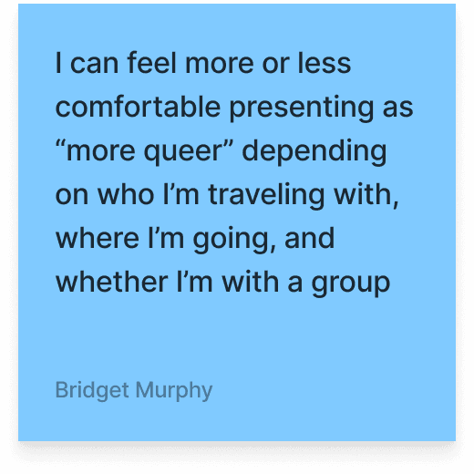
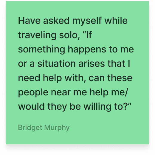
#1 - Safety: Often on queer people’s minds while traveling because they are aware that the way they present themselves to the world (i.e. clothing, accessories, body language/mannerisms) can impact their safety, especially while traveling within unfamiliar places/cultures.

#2 - Community: Wherever queer people are, they are interested in exploring different avenues to connect with their community and find events suited to their identity.

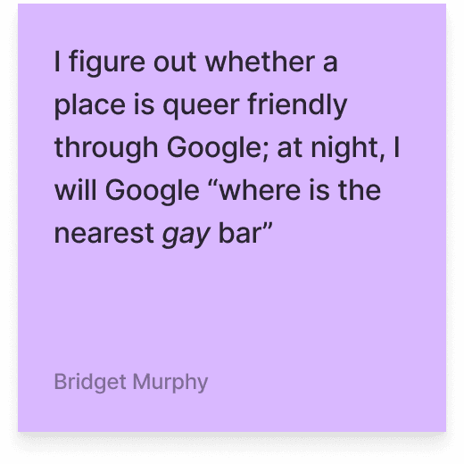

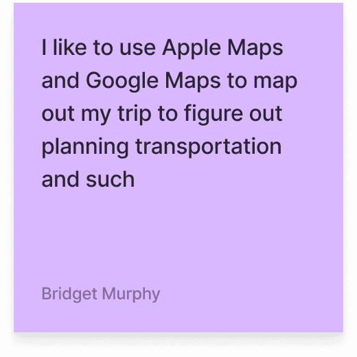
#3 - Tools for travel: While planning a trip, queer people often have to consult multiple resources to find queer-owned establishments and/or activities, such as social media (TikTok, Instagram, Pinterest), and other online sources such as Google, Google Maps, Apple Maps, Yelp.


02 / Define - Synthesis
Overview
Persona Development
User Insight
Problem Statement
Persona Development
The consistencies I found among my interview participants proved that there were opportunities for improvement in the queer travel experience. Queer people enjoy the experience of being around people in their community, even while traveling, and put a lot of effort in to find those spots ahead of their trip.
As much as queer people enjoy traveling to places where they can be authentically themselves, they are also aware that existing as a queer person is not as accepted, or even legal, in certain parts of the world.
This creates an extra layer or research when planning travel: getting an understanding of their destination’s culture and laws to remain respectful and aware, reading reviews on Google Maps or searching social media to read people’s opinions on certain travel spots, and even putting extra thought into the type of clothes they pack in case they have to be cognizant of appearing “less queer” while traveling.
From these identified opportunities, I was able to put together my User Persona.
Billie is a queer, non-binary photojournalist who travels often, always trying to capture the queer experience through their photos. Billie cares about their safety as a non-binary person moving through th world, and likes putting their time and money toward queer-owned businesses. “I want to know I’m welcome in the places I’m traveling to, and I want to uplift the queer community in the process.”

User Insight
Queer people need an easier way to find LGBTQIA+ owned/friendly establishments and activities on trips in order to engage with their community and feel safe wherever they go.
Problem Statement
Queer people often spend a lot of time and use multiple tools to find queer activities/establishments in the places they travel to, because it is important to them to feel safe and be amongst their community, but can also be time-consuming while booking travel plans.
How might we help queer people find queer-owned activities/establishments more easily (especially while traveling)?
How might we ease travel anxiety for queer people who are more at risk of being the victim of an unsafe situation, especially in an unfamiliar environment?
How might we connect queer travelers visiting the same place or seeking out the same activities?
How might we cut down the amount of time, tools, and/or research needed for queer people to book their optimal travel experience?
03 / Ideate - Create the Framework
Overview
Value Proposition
Ideation
Storyboarding
User Flow
Value Proposition Statement
Out and About is an all-in-one travel app for the queer community to find new places, be near their community, and plan the perfect trip where they know they can be authentically themselves.
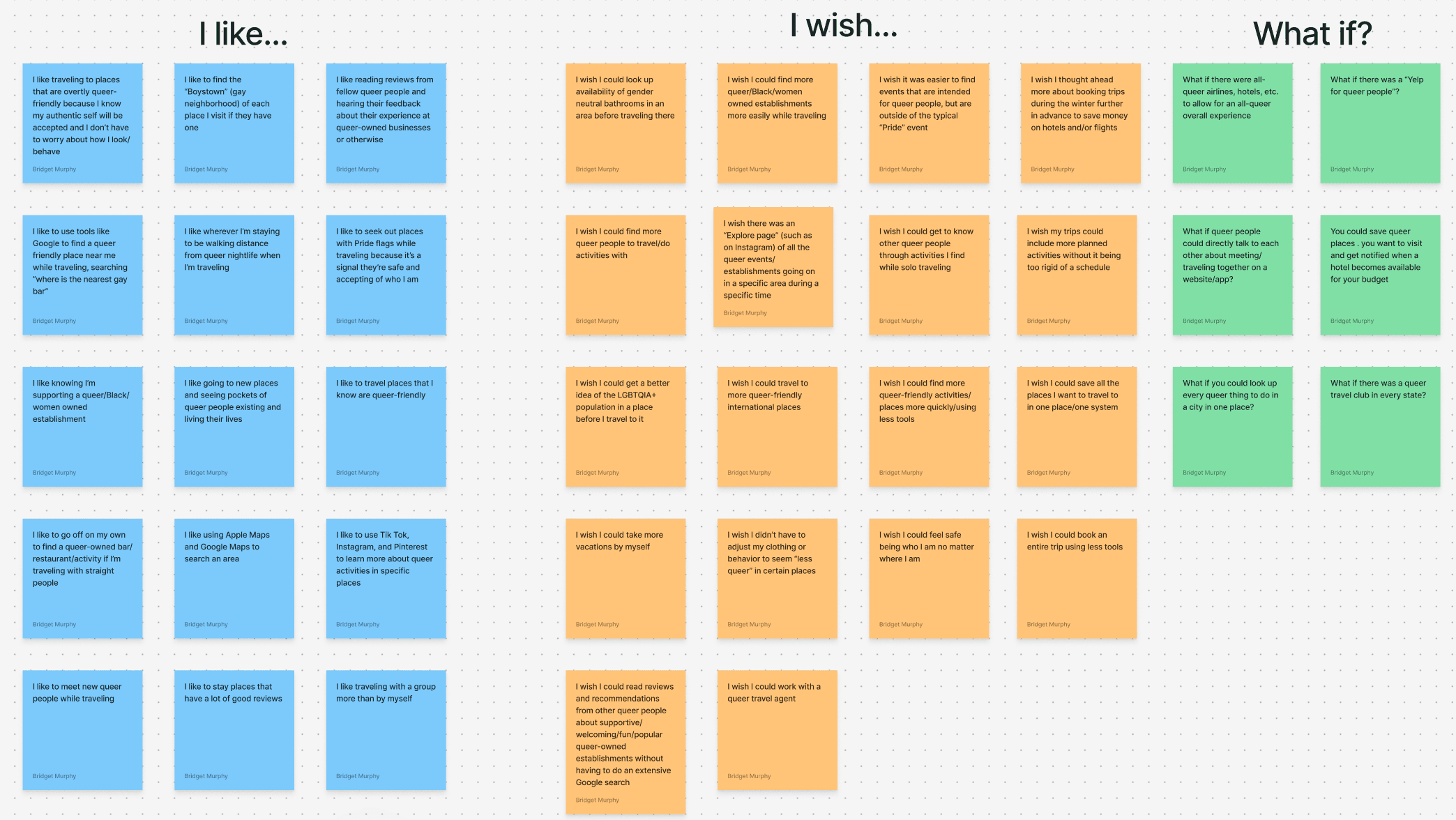
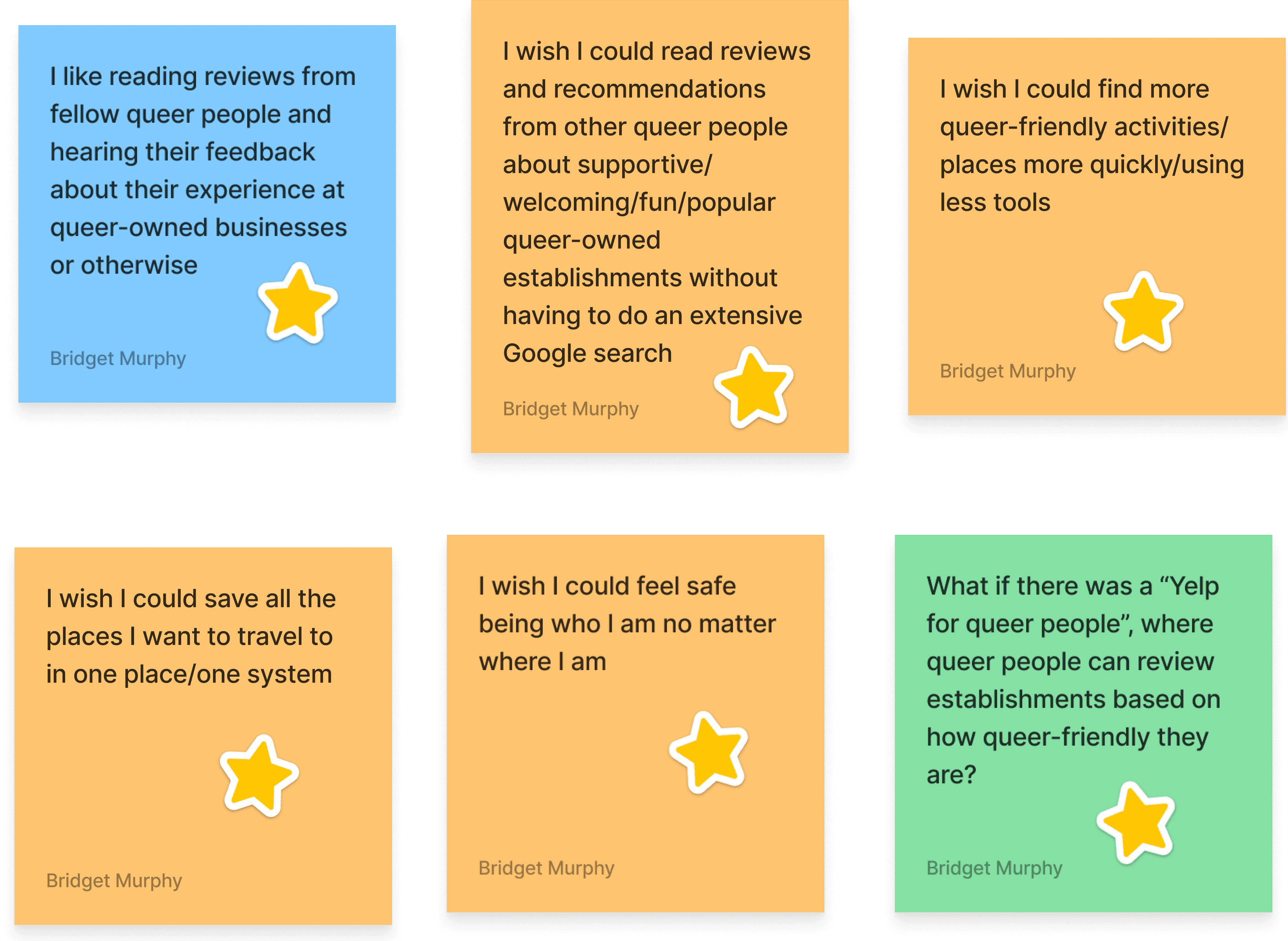
Ideation
To expand on my thought process and work towards fulfilling my value proposition, I set a 10-minute timer and completed a round of ideation using the “I like, I Wish, What If?” method.
From here, I organized my ideas into a Feature Prioritization Matrix using the How, Now, Wow method, and I was able to pull some potential ideas for features.
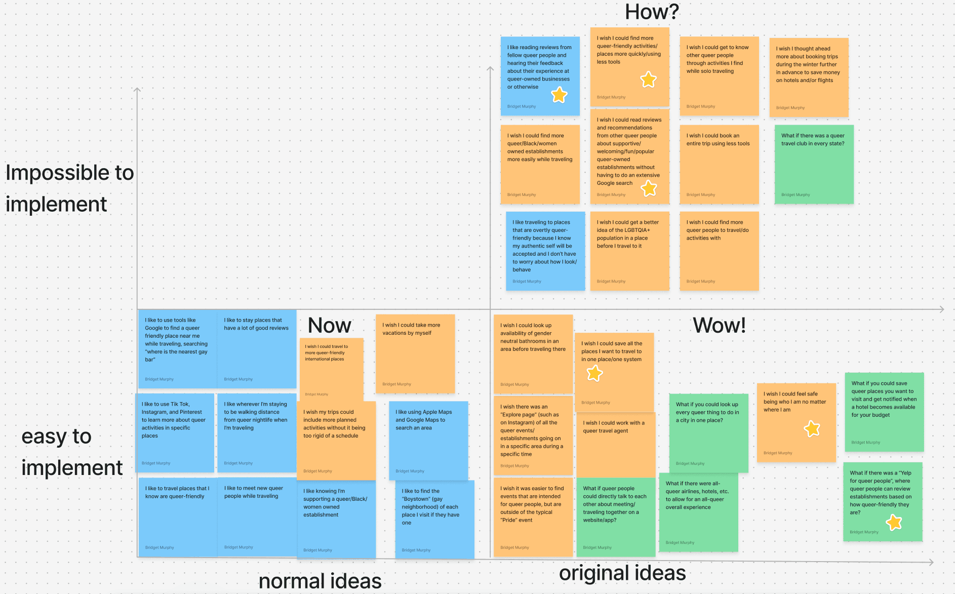
Aiming to meet the user needs identified in the research and focus on viable, realistic features that could be implemented in the time allotted, I identified these highlights:
Storyboarding
When it came to storyboarding, I came back to my User Persona, Billie, and thought about what their user experience could look like using Out and About.

Created using Canva.
User Flow
Initial User Flow
This was my first attempt at a User Flow as a UX Design student.

Part 1

Part 2
I ended up spending a good amount of time just on the login process for new and returning users, as evidenced by the user flow steps dedicated to these processes during this first iteration. I definitely felt a bit overwhelmed at this stage and spent extra time on portions of the user flow that aren’t as relevant to the actual features I was hoping to showcase in the app based off of my user research because I was more concerned with learning the basic structure of a User Flow.

The rest of my initial user flow showed users continuing their last search (for returning users) or starting a new search (with different flows for new and returning users). The search feature is for users to look up activities, locations, or places to stay, and browse reviews of each. During this first round of iteration, I forgot to create an end point at the end of my user flow, indicated by a red circle with “end” in it. This left a lot of opportunity for improvement in future iterations.
04 / Prototype - From Paper Sketches to Figma
Overview
Wireframes
“Paper” sketch wireframes
Low-fidelity wireframes
Branding
Wireframes
When it came time to think about creating the design of Out and About, I looked at two direct competitors - The International LGBTQ+ Travel Association and GayTravel - to analyze the features, strengths, and weaknesses of existing travel planning platforms for the queer community.
Both websites were very intuitive, and featured a plethora of resources for queer people to research all things related to travel, but many pages were very wordy, making specific features difficult to find. I also liked that you could read reviews left by real people who had traveled to these destinations, as well as thorough safety guides catered towards the needs and potential concerns faced by queer people. The GayTravel website seems to have a membership program that has changed or is no longer active, because I was taken to an error page when I attempted to sign up as a “Very Important Traveler”, resulting in a less than optimal user experience.
My analysis with direct competitors showed me I had an opportunity to create an app that has a more straightforward UI, a reliable membership system, incorporate the in-depth search and safety guides, and save features that exist on other queer travel websites.
As for Out and About’s indirect competitors, since all of my interviewees mentioned using a form of social media to research travel options, I wanted to look further into why younger people gravitate towards social media apps such as Instagram or TikTok versus a traditional travel website.
In general, many people, (including myself) especially younger people, are extremely comfortable navigating Instagram and TikTok if they are already members of the app, so the ability to use the search feature is more likely and the user will find the exact recommendation or location they’re searching for. While this is an advantage for these apps, even if the user saves the post or other content related to their recommendation, it is easy for them to forget to come back to it, since the primary function of the app is not for travel. Having all travel recommendations and reviews in one place would help the user keep their preferences and desired destinations more organized, more easily.
“Paper” Sketch Wireframes

Low-Fidelity Wireframes


Branding
Out and About was created before we had learned more formally about branding, styling, and UI kits. However, as I began to move forward with the overall design, I was inspired to create a simple logo and background design for Out and About using Canva.
Logo and tagline

#FCA7E4
#B2EDEF

go where you can be you
Poppins Light 55 pt
Background image

Meant to mimic the colors of the Pride flag. Created using Procreate.
For the styling of my mid-fidelity prototype, since I hadn’t yet learned about creating consistent text styles in Figma, Out and About ended up featuring many variations of the Inter Regular font, from 17pt to 45pt.
Inter Regular 17 pt
Inter Regular 45 pt
05 / Test - Test, Revise, Repeat
Overview
Low-fidelity Prototype Usability Test
Applying Revisions
Final Design
Next Steps
Conclusion and takeaways
Low-Fidelity Prototype Usability Test
I conducted one round of remote moderated guerrilla testing of my low-fidelity prototype on three users via Zoom. I sought to understand users’ general impressions of Out and About’s appearance and existing functionality.
Testing Objectives
Can users explore Out and About’s features without having to sign up or log into their account?
Can users successfully up for an account?
Tasks
Explore the “search by location” feature without logging in or signing up first.
Locate to hiking recommendations without logging in or signing up for an account.
Find recommendations in North America, then navigate back to the “New Search” page
Results and Suggestions
100% of testers were able to successfully complete all three tasks
Add iOS elements
Make text smaller, especially compared to logo
Round out buttons
Add text box to images to indicate that it is an image
Make every button big enough to click
Applying Revisions
I was able to apply the feedback I received on my low-fidelity prototype and was grateful for the opportunity to improve the way it appeared and functioned.
Sign-up page
Low-fidelity
Mid-fidelity
I applied all revision suggestions listed above, plus:
Moved “verify email” message off of sign up page and changed to a pop-up window in mid-fidelity version
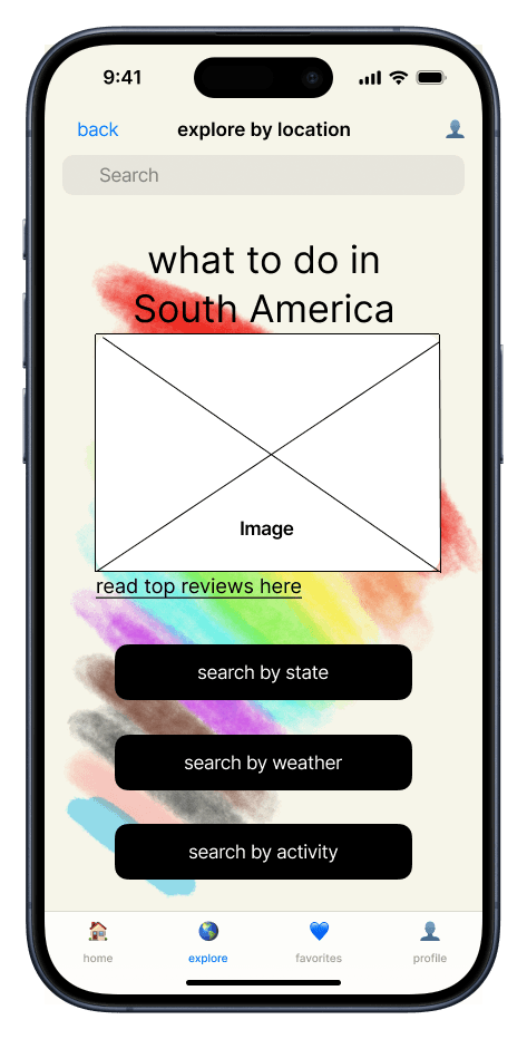
Explore by location page
Low-fidelity
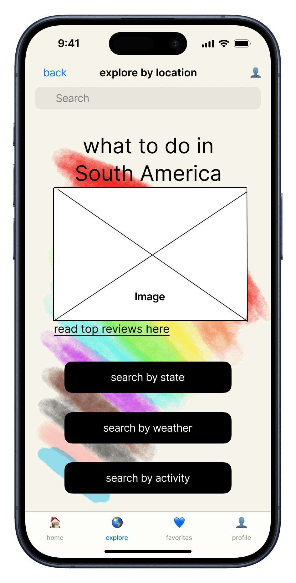
Mid-fidelity
Applied all revision suggestions above, plus:
Added search bar
Added tabs at the bottom for easier navigation
Moved location of “back” button
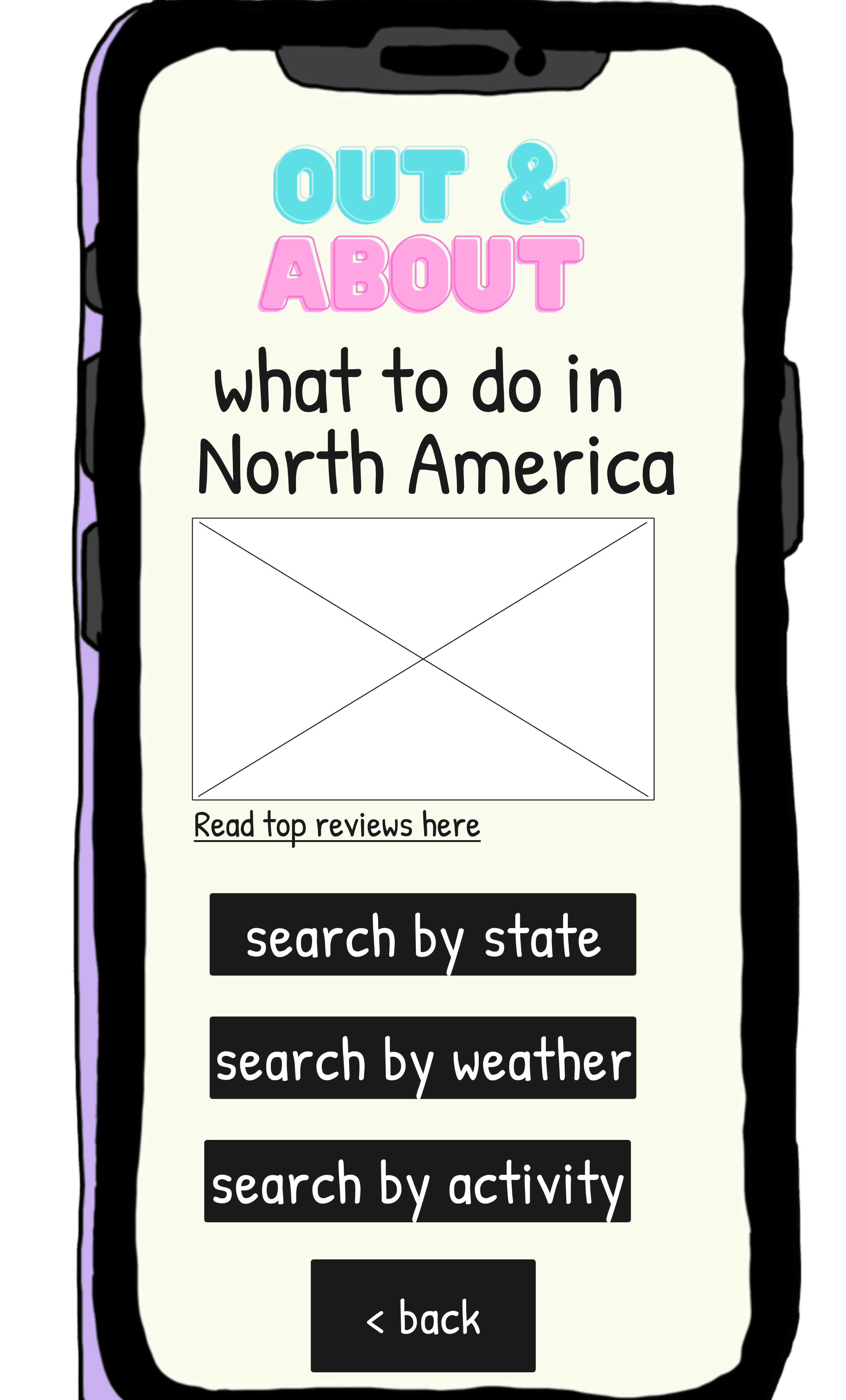
Changed location from North to South America to help communicate that the app is not only focused in North America
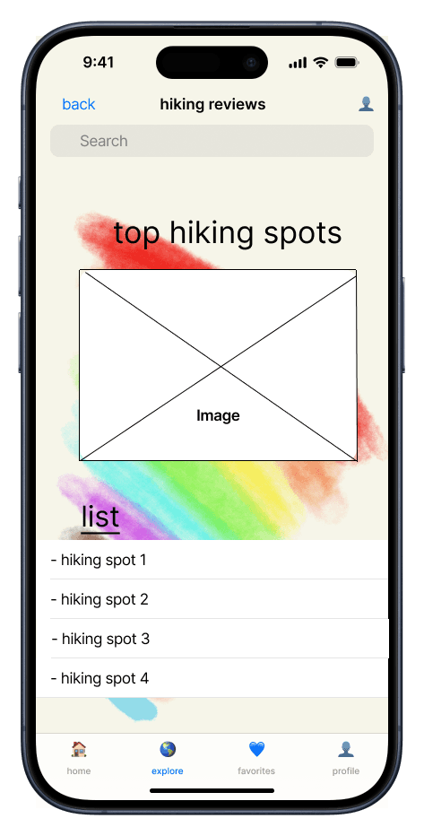
Explore by activity page

Low-fidelity
Mid-fidelity
Applied all revision suggestions above, plus:
Added search bar
Added tabs at the bottom for easier navigation
Moved location of “back” button
Final Design


view final prototype
Mid-Fidelity Prototype
In addition to applying the revisions from my user tests on my to low to mid-fidelity prototype, I updated my overall user flow. In this last round of revision, I re-organized the onboarding process to improve the visual flow, created additional pages to highlight the safety and user preference features that I had originally identified, but did not get to in my first couple rounds of wireframes, and established a distinct end point for users to know when they are not able to navigate any further within the app.
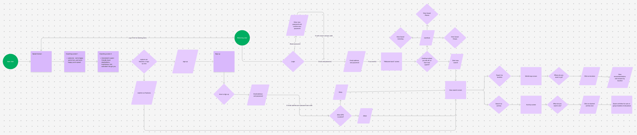
Final User Flow, part 1

I edited the overall structure so both the New and Returning users both start in the same place. I also reduced the number of overall steps to log in or sign up, but the structure of a new or continued search is still a little cluttered and confusing.
Final User Flow, part 2
For the latter half of my user flow, I once again was trying to make it look more straightforward, although the “Allow GPS Location” flow still looks a little clunky with the way I drew my arrows. I made sure to include a red circle to indicate an end point for this flow, which I forgot to do with my first user flow.
Though I did my best to make the overall flow appear more clear and less chaotic, it does still look a little overwhelming upon first glance. To improve this, I would restructure the flow so it is more spread out, or consolidate the number of steps I’ve included that may not be absolutely necessary for the overall flow.
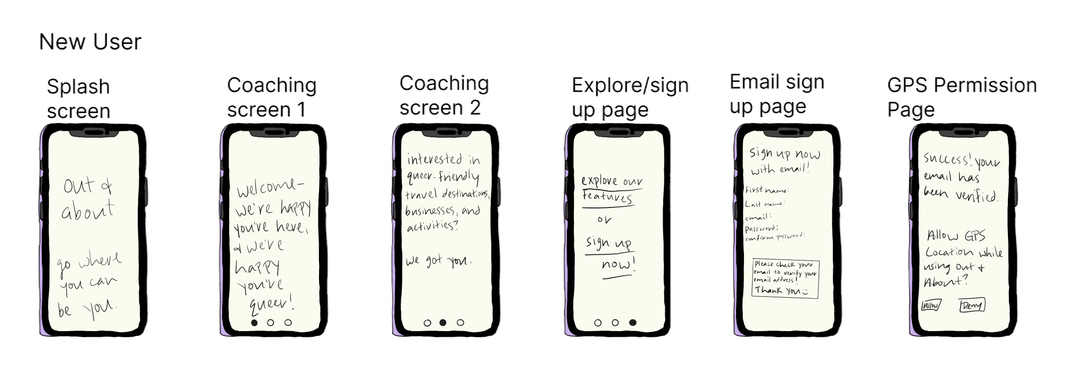
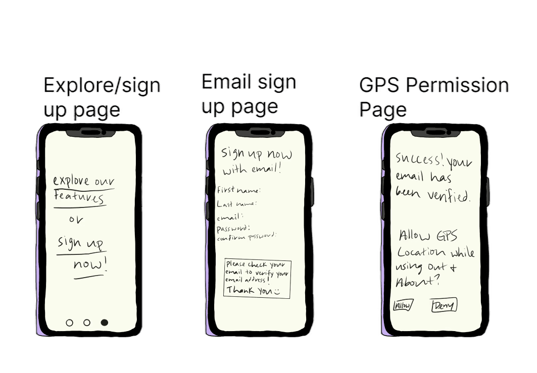
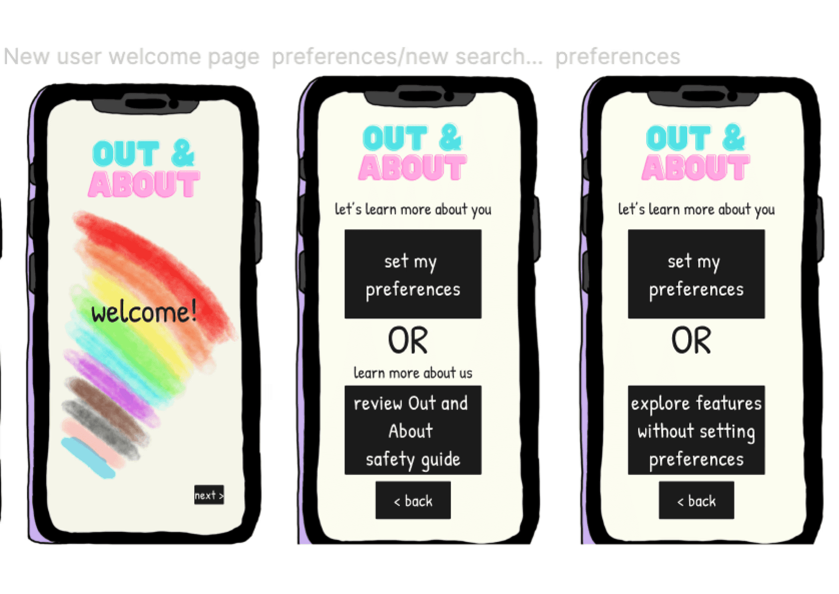
New User
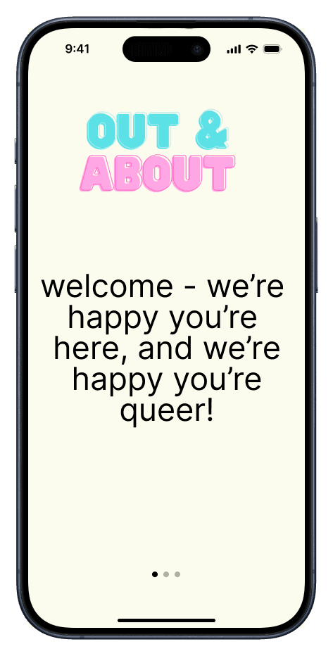


New users will go through a series of coaching screens before choosing to explore Out and About’s features without creating an account, or sign up to create an account right away.
New User - Email sign up process
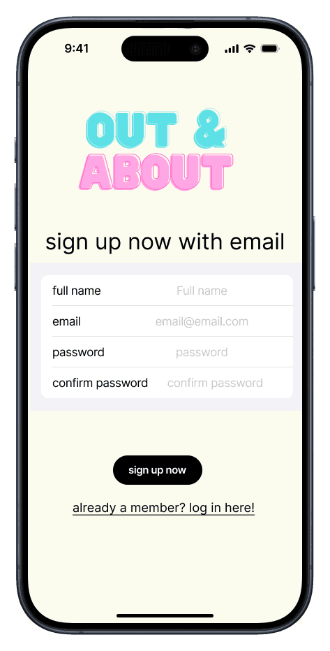
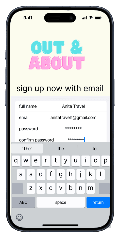


New users who choose to sign up for an account right away will be taken through a simple sign up process, then will be asked to verify their email outside of the app before proceeding to the “Welcome” screen. Since these were some of my first days using Figma, a lot of my time was used figuring out the basic functionality, resulting a very thorough onboarding/log in process, and not as much time was dedicated to building out the actual features, such as the Preferences and Safety Guides.
Safety and user preference guides


New users will be taken to this choice screen after the “welcome” screen to set their preferences, review Out and About’s safety guides, or skip ahead to the app’s features.
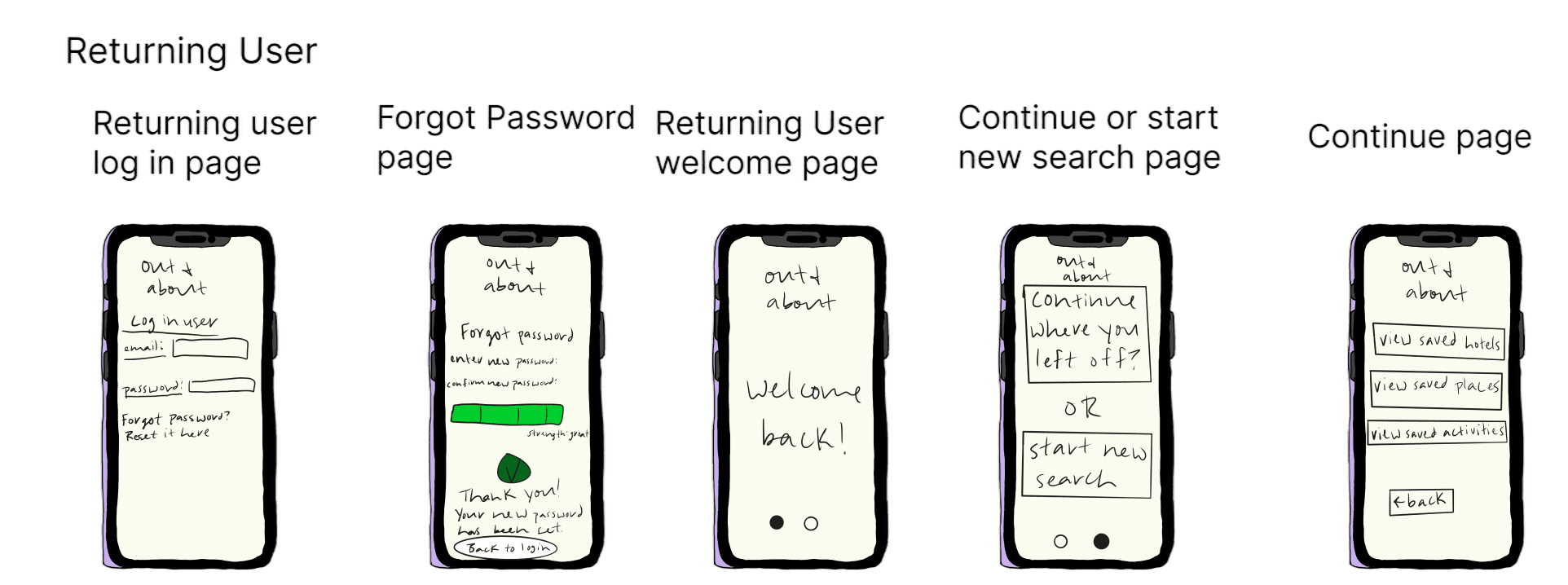
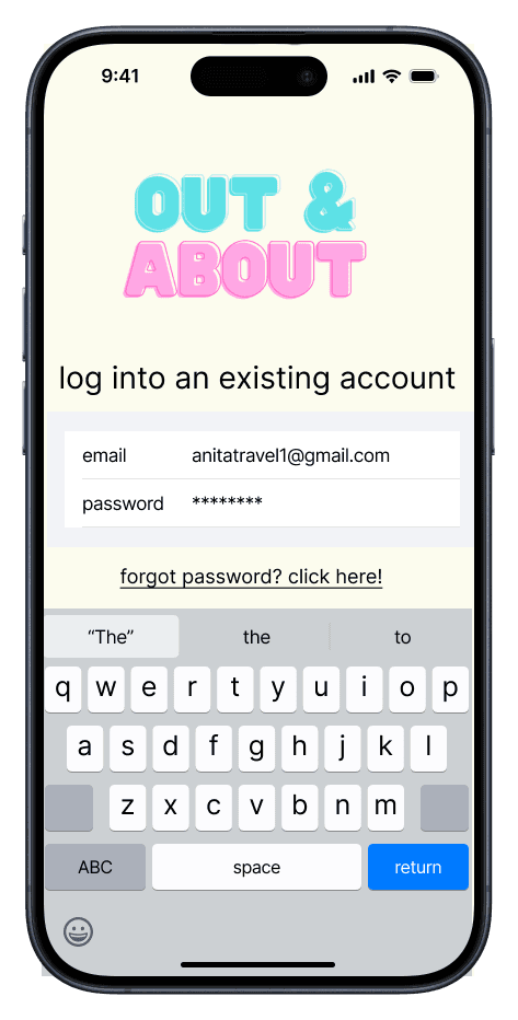
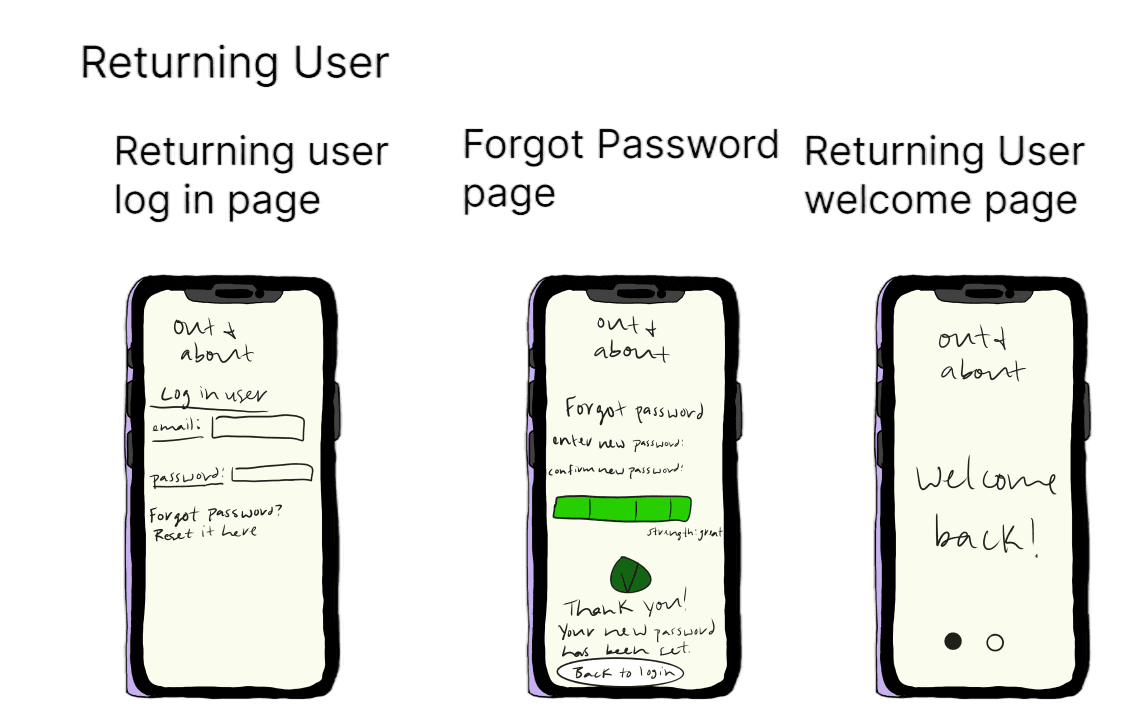
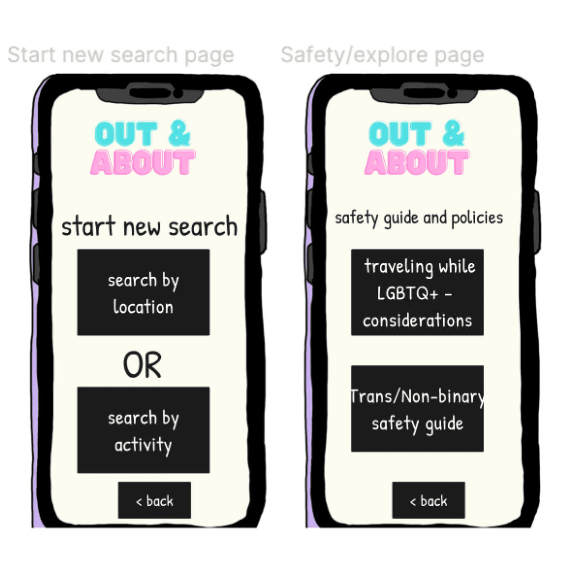
Returning User


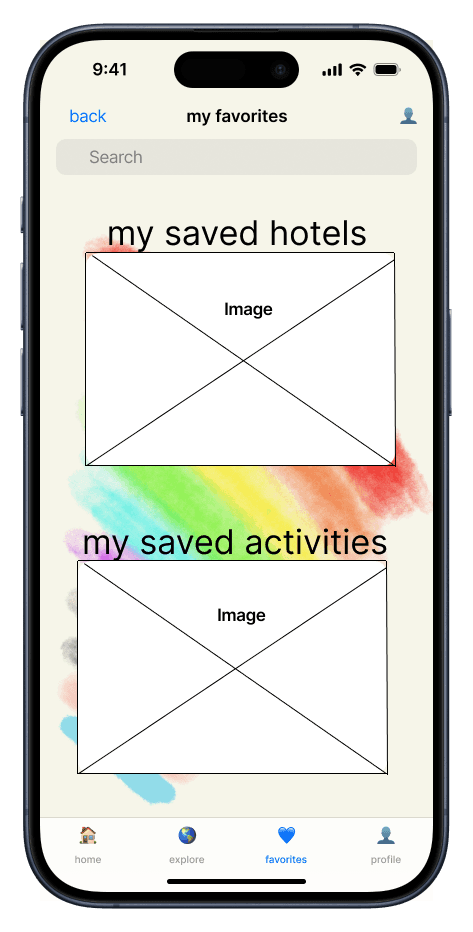

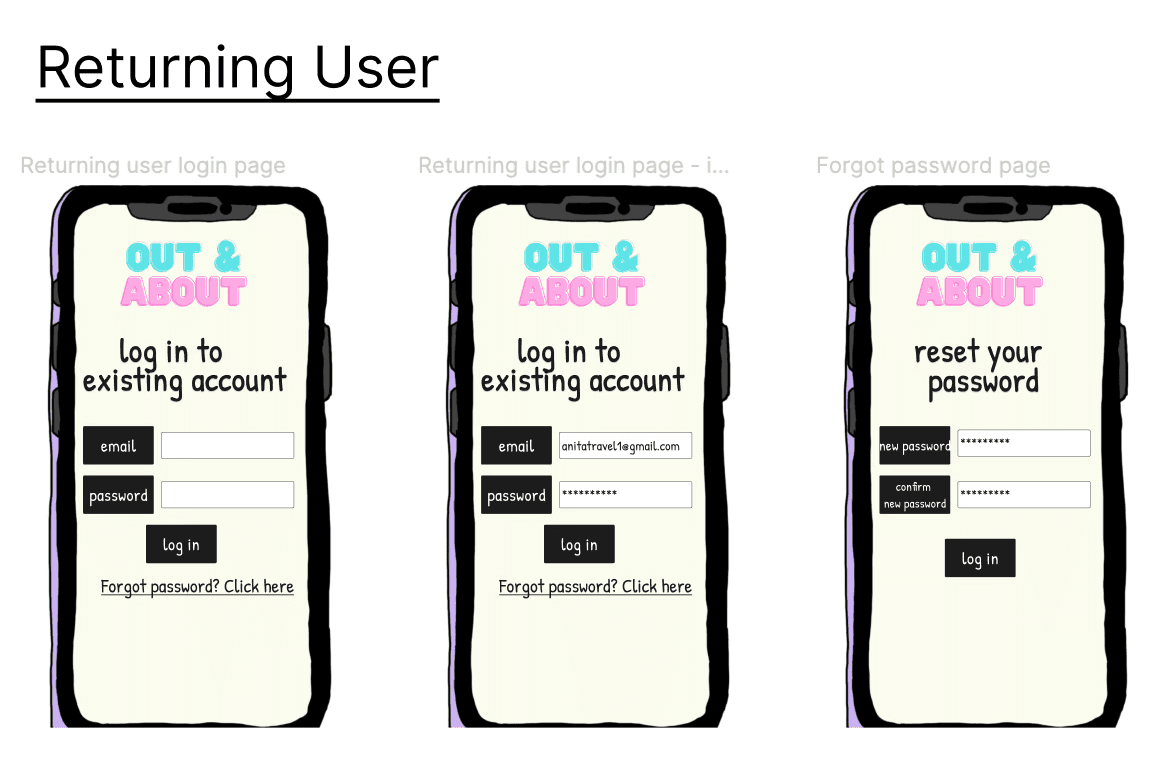
A returning user is taken straight to the login screen, then the “Welcome back!” screen once they’ve successfully signed in. They’re given the option to continue their previous search or start a new search under the Explore tab (since users mentioned they would like a way to keep track of the travel activities/destinations they’ve searched for), and they can view the hotels and activities they’ve previously saved under the Favorites tab. The final tab shows the user’s Profile, which includes an option for returning users to view their personal preferences in addition to Out and About’s safety guides.
Returning User - Forgot password

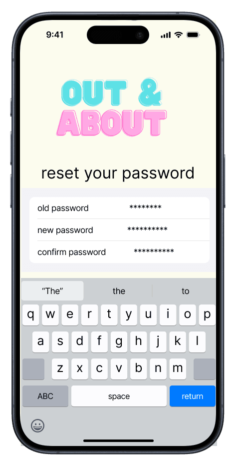
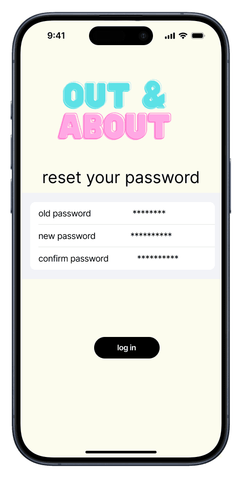
I created a short flow for returning users to reset their password if they forget it.
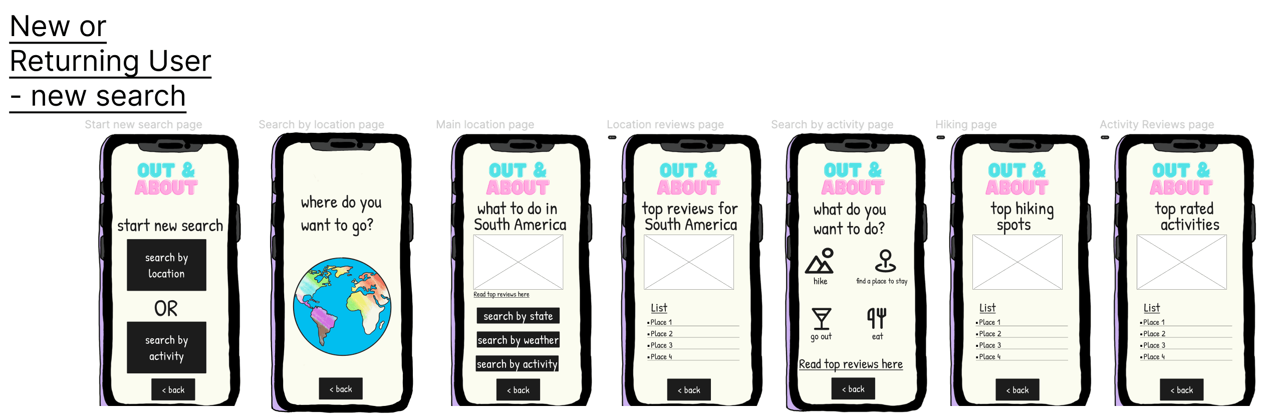
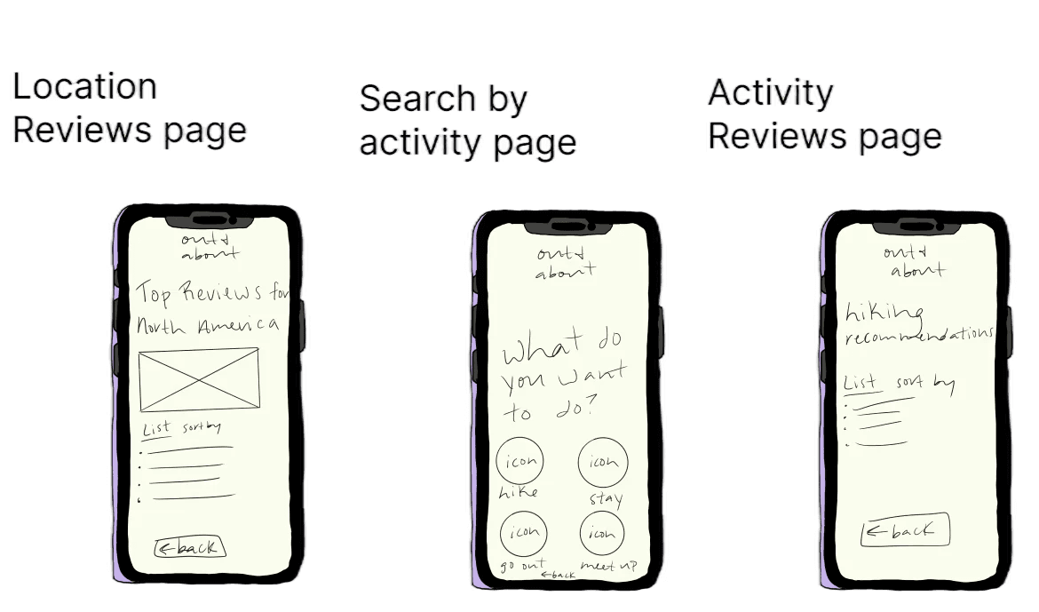
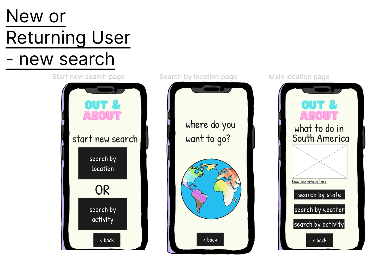
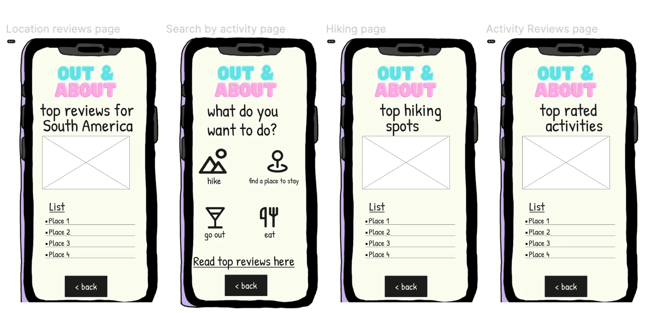
New or Returning User - New search


This flow shows the process of searching by location (South America) or activity (hiking). This flow looks the same for both new and returning users; they just take slightly different paths to get to this point in the app.
If I had more time, I would...
Conduct another round of user testing on my mid-fidelity prototype to gather/apply feedback
Improve my User Flow to lay out each feature in a more clear and straightforward way
Build out the safety guides more thoroughly - include basic information as well as special considerations for non-binary and transgender people while traveling
Build out the “preferences” section - include information about gender identity, desired destinations/activities, special accommodations such as gender-neutral restrooms, etc.) and provide more curated search options based on those preferences, which would shape the user’s Home tab
Include a feature that helps queer people connect and meet each other through shared interests in destinations/activities, as well as options for solo vs. group travelers
Include a “search by your why” feature (help curate preferences further), help connect newer travelers with more seasoned travelers
Conclusion and Takeaways
I learned so much, so fast throughout my first project. I had a lot of fun utilizing such a wide variety of skills, and even when things got frustrating or confusing, I felt confident in my ability to seek out the answer myself or depend on my instructor/TAs/classmates/other resources. It’s hard to believe how much you can learn and create in 4 weeks!
Don’t get trapped in the details!
I can be an overthinker, and there were several elements throughout this project that I could have spent several more hours on. I learned a lot about when to let go of a specific portion (especially the wireframes/prototypes) and allow myself to move on to the next part to stay on track.
Trust your research, and keep it in focus
There were times when I was building my wireframing/prototyping/user testing portion that I started to doubt what I had already created, and questioned whether I was actually acknowledging what my users had identified as their pain points during our interviews. Instead of spending a bunch of extra time crafting unnecessary new wireframes, I chose to continue in the direction I was heading, and trust that I accurately created features that meet some of the users needs/wants.
Ask for help and feedback as often as possible
Throughout this project, I quickly understood that I was being taught by and learning alongside some incredibly intelligent, hard-working, passionate people in my boot camp. It was so exciting to share something I was working on and getting positive feedback, or even better, constructive feedback that ultimately leads to my project being better. I loved getting to explain my reasoning during my User Testing and apply the feedback I received. Knowing my final project exists because of everyone who helped me along the way is a very satisfying feeling.
Have any thoughts or questions about this project?
Let’s discuss!
contact me
Have any thoughts or questions about this project?
Let’s discuss!
contact me
02 / Define - Synthesis
Overview
Persona Development
User Insight
Problem Statement
Persona Development
The consistencies I found among my interview participants proved that there were opportunities for improvement in the queer travel experience. Queer people enjoy the experience of being around people in their community, even while traveling, and put a lot of effort in to find those spots ahead of their trip.
As much as queer people enjoy traveling to places where they can be authentically themselves, they are also aware that existing as a queer person is not as accepted, or even legal, in certain parts of the world.
This creates an extra layer or research when planning travel: getting an understanding of their destination’s culture and laws to remain respectful and aware, reading reviews on Google Maps or searching social media to read people’s opinions on certain travel spots, and even putting extra thought into the type of clothes they pack in case they have to be cognizant of appearing “less queer” while traveling.
From these identified opportunities, I was able to put together my User Persona.
Billie is a queer, non-binary photojournalist who travels often, always trying to capture the queer experience through their photos. Billie cares about their safety as a non-binary person moving through th world, and likes putting their time and money toward queer-owned businesses. “I want to know I’m welcome in the places I’m traveling to, and I want to uplift the queer community in the process.”
User Insight
Queer people need an easier way to find LGBTQIA+ owned/friendly establishments and activities on trips in order to engage with their community and feel safe wherever they go.
Problem Statement
Queer people often spend a lot of time and use multiple tools to find queer activities/establishments in the places they travel to, because it is important to them to feel safe and be amongst their community, but can also be time-consuming while booking travel plans.
How might we help queer people find queer-owned activities/establishments more easily (especially while traveling)?
How might we ease travel anxiety for queer people who are more at risk of being the victim of an unsafe situation, especially in an unfamiliar environment?
How might we connect queer travelers visiting the same place or seeking out the same activities?
How might we cut down the amount of time, tools, and/or research needed for queer people to book their optimal travel experience?
03 / Ideate - Create the
Framework
Overview
Value Proposition
Ideation
Storyboarding
User Flow
Value Proposition Statement
Out and About is an all-in-one travel app for the queer community to find new places, be near their community, and plan the perfect trip where they know they can be authentically themselves.
Ideation
To expand on my thought process and work towards fulfilling my value proposition, I set a 10-minute timer and completed a round of ideation using the “I like, I Wish, What If?” method.
From here, I organized my ideas into a Feature Prioritization Matrix using the How, Now, Wow method. I was able to pull some potential ideas for features.
Aiming to meet the user needs identified in the research and focus on viable, realistic features that can be implemented in the time allotted, I identified these highlights:


Storyboarding
When it came to storyboarding, I came back to my User Persona, Billie, and thought about what their user experience could look like using Out and About.
Created using Canva.
User Flow
Initial User Flow
This was my first attempt at a User Flow as a UX Design student.
Part 1
Part 2
I ended up spending a good amount of time just on the login process for new and returning users, as evidenced by the user flow steps dedicated to these processes during this first iteration. I definitely felt a bit overwhelmed at this stage and spent extra time on portions of the user flow that aren’t as relevant to the actual features I was hoping to showcase in the app based off of my user research because I was more concerned with learning the basic structure of a User Flow.
The rest of my initial user flow showed users continuing their last search (for returning users) or starting a new search (different flows for new or returning users). The search feature is for users to look up activities, locations, or places to stay, and browse reviews of each. During this first round of iteration, I forgot to create an end point at the end of my user flow, indicated by a red circle with “end” in it. This left a lot of opportunity for improvement in future iterations.
04 / Prototype - From Paper Sketches to Figma
Overview
Wireframes
“Paper” sketch wireframes
Low-fidelity wireframes
Branding
Wireframes
When it came time to think about creating the design of Out and About, I looked at two direct competitors - The International LGBTQ+ Travel Association and GayTravel - to analyze the features, strengths, and weaknesses of existing travel planning platforms for the queer community.
Both websites were very intuitive, and featured a plethora of resources for queer people to research all things related to travel, but many pages were very wordy, making specific features difficult to find. I also liked that you could read reviews left by real people who had traveled to these destinations, as well as thorough safety guides catered towards the needs and potential concerns faced by queer people. The GayTravel website seems to have a membership program that has changed or is no longer active, because I was taken to an error page when I attempted to sign up as a “Very Important Traveler”.
My analysis with direct competitors showed me I had an opportunity to create an app that has a more straightforward UI, a reliable membership system, incorporate the in-depth search and safety guides, and save features that exist on other queer travel websites.
As for Out and About’s indirect competitors, since all of my interviewees mentioned using a form of social media to research travel options, I wanted to look further into why younger people gravitate towards social media apps such as Instagram or TikTok versus a traditional travel website.
In general, many people, (including myself) especially younger people, are extremely comfortable navigating Instagram and TikTok if they are already members of the app, so the ability to use the search feature is more likely and the user will find the exact recommendation or location they’re searching for. While this is an advantage for these apps, even if the user saves the post or other content related to their recommendation, it is easy for them to forget to come back to it, since the primary function of the app is not for travel. Having all travel recommendations and reviews in one place would help the user keep their preferences and desired destinations more organized, more easily.
“Paper” Sketch Wireframes


Low-Fidelity Wireframes
view low-fidelity prototype
view low-fidelity prototype
Branding
Out and About was created before we had learned more formally about branding, styling, and UI kits. However, as I began to move forward with the overall design, I was inspired to create a simple logo and background design for Out and About using Canva.
Logo and tagline
#FCA7E4
#B2EDEF
go where you can be you
Poppins Light 55 pt
Background image
Meant to mimic the colors of the Pride flag. Created using Procreate.
For the styling of my mid-fidelity prototype, since I hadn’t yet learned about creating consistent text styles in Figma, Out & About ended up featuring many variations of the Inter Regular font, from 17pt to 45pt.
Inter Regular 17 pt
Inter Regular 45 pt
05 / Test - Test, Revise, Repeat
Overview
Low-fidelity Prototype Usability Test
Applying Revisions
Final Design
Next Steps
Conclusion and takeaways
Low-Fidelity Prototype Usability Test
I conducted one round of remote moderated guerrilla testing of my low-fidelity prototype on three users. I sought to understand users’ general impressions of Out and About’s appearance and existing functionality.
Testing Objectives
Can users explore Out and About’s features without having to sign up or log into their account?
Can users successfully up for an account?
Tasks
Explore the “search by location” feature without logging in or signing up first.
Locate to hiking recommendations without logging in or signing up for an account.
Find recommendations in North America, then navigate back to the “New Search” page
Results and Suggestions
100% of testers were able to successfully complete all three tasks
Add iOS elements
Make text smaller, especially compared to the logo
Round out buttons
Add text box to images to indicate that it is an image
Make every button big enough to click
Applying Revisions
I was able to apply the feedback I received on my low-fidelity prototype and was grateful for the opportunity to improve the way appeared and functioned.
Sign-up page
Low-fidelity
Mid-fidelity
I applied all revision suggestions above, plus:
Moved “verify email” message off of sign up page and changed to a pop-up window in mid-fidelity version
Explore by location page
Low-fidelity
Mid-fidelity
Applied all revision suggestions above, plus:
Added search bar
Added tabs at the bottom for easier navigation
Moved location of “back” button
Changed location from North to South America to help communicate that the app is not only focused in North America
Explore by activity page
Low-fidelity
Mid-fidelity
Applied all revision suggestions above, plus:
Added search bar
Added tabs at the bottom for easier navigation
Moved location of “back” button
Final Design
view final prototype
view final prototype
Mid-Fidelity Prototype
In addition to applying the revisions from my user tests on my to low to mid-fidelity prototype, I updated my overall user flow. In this last round of revision, I re-organized the onboarding process to improve the visual flow, created additional pages to highlight the safety and user preference features that I had originally identified, but did not get to in my first couple rounds of wireframes, and established a distinct end point for users to know when they are not able to navigate any further within the app.
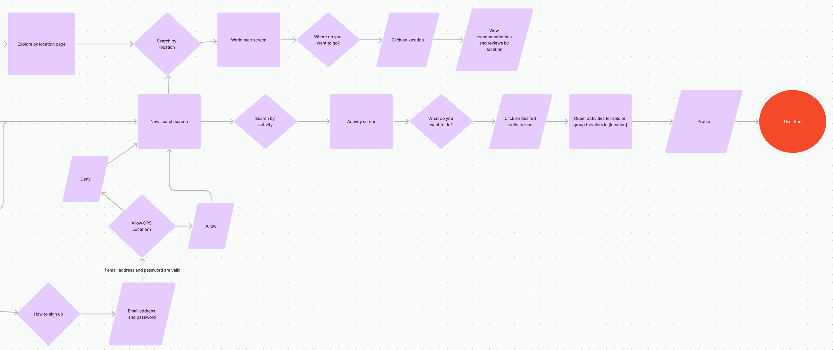
Final User Flow, part 1
I edited the overall structure so both the New and Returning users both start in the same place. I also reduced the number of overall steps to log in or sign up, but the structure of a new or continued search is still a little cluttered and confusing.
Final User Flow, part 2
For the latter half of my user flow, I once again was trying to make it look more straightforward, although the “Allow GPS Location” flow still looks a little clunky with the way I drew my arrows. I made sure to include a red circle to indicate an end point for this flow, which I forgot to do with my first user flow.
Though I did my best to make the overall flow appear more clear and less chaotic, it does still look a little overwhelming upon first glance. To improve this, I would restructure the flow so it is more spread out, or consolidate the number of steps I’ve included that may not be absolutely necessary for the overall flow.
New User
New users will go through a series of coaching screens before choosing to explore Out and About’s features without creating an account, or sign up to create an account right away.
New User - Email sign up process
New users who choose to sign up for an account right away will be taken through a simple sign up process, then will be asked to verify their email outside of the app before proceeding to the “Welcome” screen. Since these were some of my first days using Figma, a lot of my time was used figuring out the basic functionality, resulting a very thorough onboarding/log in process, and not as much time was dedicated to building out the actual features, such as the Preferences and Safety Guides.
Safety and user preference guides
New users will be taken to this choice screen after the “welcome” screen to set their preferences, review Out and About’s safety guides, or skip ahead to the app’s features.
Returning User
A returning user is taken straight to the login screen, then the “Welcome back!” screen once they’ve successfully signed in. They’re given the option to continue their previous search or start a new search under the Explore tab (since users mentioned they would like a way to keep track of the travel activities/destinations they’ve searched for), and they can view the hotels and activities they’ve previously saved under the Favorites tab. The final tab shows the user’s Profile, which includes an option for returning users to view their personal preferences in addition to Out and About’s safety guides.
Returning User - Forgot password
Created a short flow for returning users to reset their password if they forget it.
New or Returning User - New search
This flow shows the process of searching by location (South America) or activity (hiking). This flow looks the same for both new and returning users; they just have slightly different paths to get to this point in the app.
If I had more time, I would...
Conduct a round of user testing on my mid-fidelity prototype to gather/apply feedback
Improve my User Flow to lay out each feature in a more clear and straightforward way
Build out the safety guides more thoroughly - include basic information as well as special considerations for non-binary and transgender people while traveling.
Build out the “preferences” section - include information about gender identity, desired destinations/activities, special accommodations such as gender-neutral restrooms, etc.) and provide more curated search options based on those preferences, which would shape the user’s Home tab
Include a feature that helps queer people connect and meet each other through shared interests in destinations/activities, as well as options for solo vs. group travelers
Include a “search by your why” feature (help curate preferences further), help connect newer travelers with more seasoned travelers
Conclusion and Takeaways
I learned so much, so fast throughout my first project. I had a lot of fun utilizing such a wide variety of skills, and even when things got frustrating or confusing, I felt confident in my ability to seek out the answer myself or depend on my instructor/TAs/classmates/other resources. It’s hard to believe how much you can learn and create in 4 weeks!
Don’t get trapped in the details!
I can be an overthinker and there were several elements throughout this project that I could have spent several more hours on. I learned a lot about when to let go of a specific portion (especially the wireframes/prototypes) and allow myself to move on to the next part to stay on track.
Trust your research, and keep it in focus
There were times when I was building my wireframing/prototyping/user testing portion that I started to doubt what I had already created, and questioned whether I was actually acknowledging what my users had identified as their pain points during our interviews. Instead of spending a bunch of extra time crafting unnecessary new wireframes, I chose to continue in the direction I was heading, and trust that I accurately created features that meet some of the users needs/wants.
Ask for help and feedback as often as possible
Throughout this project, I quickly understood that I was being taught by and learning alongside some incredibly intelligent, hard-working, passionate people in my boot camp. It was so exciting to share something I was working on and getting positive feedback, or even better, constructive feedback that ultimately leads to my project being better. I loved getting to explain my reasoning during my User Testing and apply the feedback I received. Knowing my final project exists because of everyone who helped me along the way is a very satisfying feeling.
Project Goal
Design a mid-fidelity mobile travel application. This project was the first of our boot camp, and my introduction to both the design process and Figma!
Overview
ROLE:
UX Designer; sole author
TIMELINE:
4 weeks - 30+ hours
TOOLS USED:
Figma / Canva / Procreate
Note: This project is a fictitious scenario, completed as a part of UC Berkeley’s Online Extension UX/UI Design Program. The interviews and user testing were all conducted with real people, however.
view final prototype
view final prototype
01 / Empathize - User Research
Overview
Research Approach
User Interviews
Research Approach
To better understand the pain points and unmet needs for LGBTQIA+ individuals planning their travel experience, I decided to conduct five user interviews. I recruited my participants by posting on my Instagram story asking for volunteers who identify as LGBTQIA+.
Research Problem
Assess the factors that go into planning and executing travel decisions for young queer people.
Research Objectives
Learn what motivates queer people to travel, and what is most important for an optimal travel experience
Get a better understanding of the different tools queer people use when planning or booking travel, and how they feel about the usability of each
Understand unique factors (advantages/challenges) when traveling as a queer person
Demographic Information
25 - 27
Age
non-binary
male
female
Gender Identity
lesbian
bisexual
pansexual
gay
Sexual Orientation
User Interviews
I conducted each interview via Zoom. I had great conversations with each of my interviewees. To organize their responses and identify any recurring themes or pain points, I created an Affinity Diagram.
Top Takeaways
#1 - Safety: Often on queer people’s minds while traveling because they are aware that the way they present themselves to the world (i.e. clothing, accessories, body language/mannerisms) can impact their safety, especially while traveling within unfamiliar places/cultures.
#3 - Tools for travel: While planning a trip, queer people often have to consult multiple resources to find queer-owned establishment and/or activities, such as social media (TikTok, Instagram, Pinterest), Google, Google Maps, Apple Maps, Yelp)
#2 - Community: Wherever queer people are, they are interested in exploring different avenues to connect with their community and find events suited to their identity.