

Tinklr
"Know where to go when you gotta go"
Helping users find their perfect public restroom
Overview
ROLE:
UX Designer; team of 4
TIMELINE:
4 weeks - 30+ hours
TOOLS USED:
Figma / Canva / Procreate / Trello
Note: This project is a fictitious scenario, completed as a part of UC Berkeley’s Online Extension UX/UI Design Program. The interviews and user testing were all conducted with real people, however.
Problem
The modern on-the-go adult needs a convenient and accurate way to find clean, private, and well-supplied public restrooms because our research shows that a majority of users struggle to find public restrooms that address their specific needs and preferences.
Solution
Tinklr is a mobile application that helps users search for and locate public restrooms that suit their needs.
view final prototype
Project Goal
Design a high-fidelity mobile application that solves a real, everyday problem for users. This project was the first group project of my boot camp.
01 / Empathize - User Research
Research Objectives
Learn about people's current experience finding and using public restrooms
What people look for in a public restroom that makes it more or less desirable to use
Discuss any specific needs that may cause people to seek out a public restroom more (ex: being a parent, having a health condition, etc.)
Demographic Information


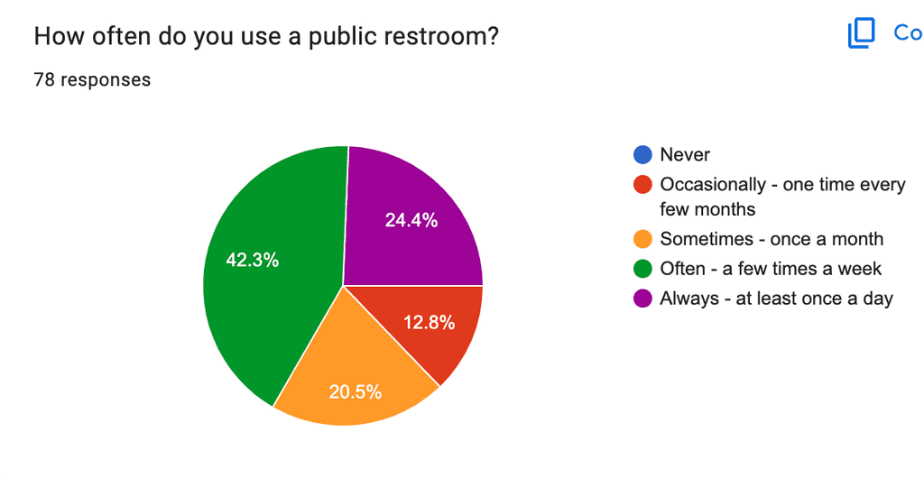

Survey Findings
We received a lot of great feedback from our survey. To organize the responses and identify any recurring themes or pain points, we created an Affinity Diagram and an Empathy Map.
Top Takeaways
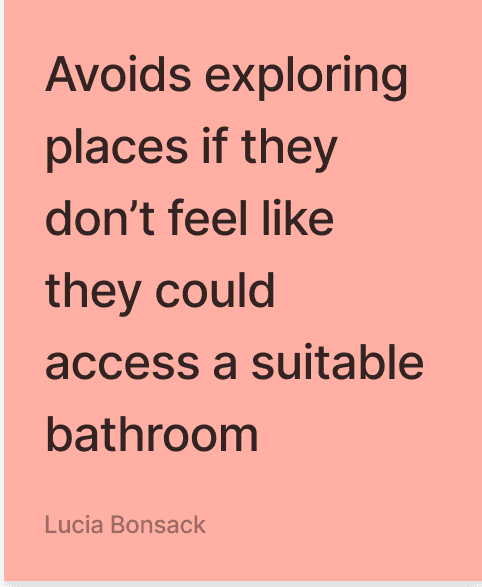
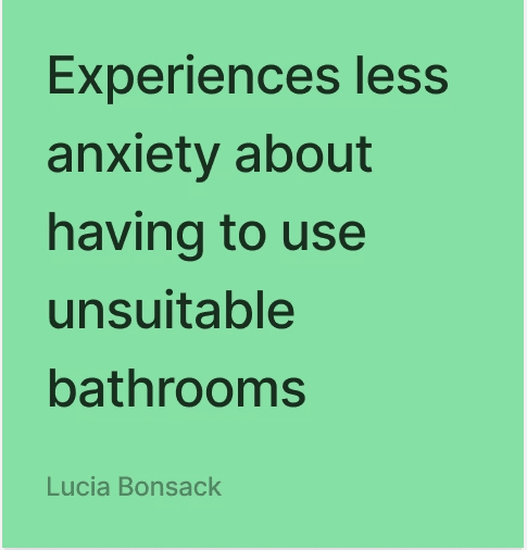
#1 - Proximity: A lot of the feedback we received concerned needing to find a public restroom at a moment's notice, sometimes due to medical conditions, including seizures, IBS, and internal cystitis
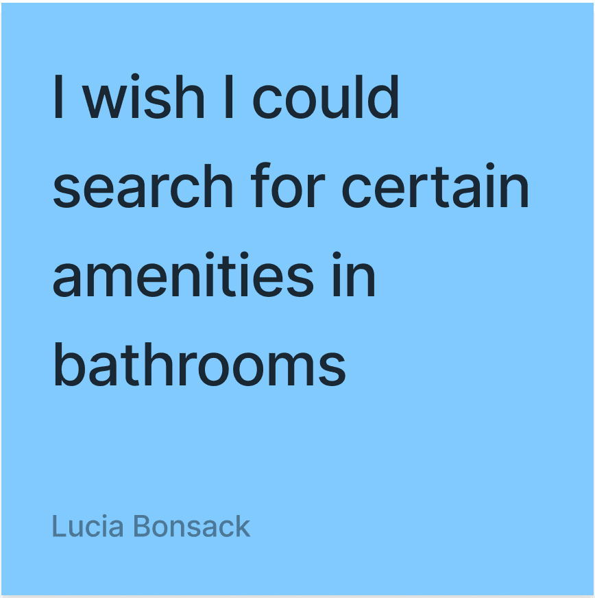
#2 - Quality: Half of our survey respondents mentioned cleanliness when looking for a restroom. Many also mentioned a preference for public restrooms that are well-stocked, private, and have pleasing decor. Several people said they only visit certain chain businesses' restrooms because they can depend on the quality and availability, especially when in a rush or in an emergency.
Taken from Google Form feedback


"Pains" Highlights
"Gains" Highlights


Overview
Research Approach
Survey Findings
Research Approach
Our team created a Google survey with 13 questions to assess current pain points and opportunities for the public restroom experience, and whether there is a need for help with locating public restrooms. Myself and one other group member posted the survey on our Instagram stories to collect responses.
Research Problem
Understand if there is a need for help with locating public restrooms.


02 / Define - Synthesis
Overview
Persona Development
User Insight
Problem Statement
Competitor Analysis
Persona Development
The consistencies our team found among our survey participants proved that there were opportunities for user's experience finding an accessible, reliable public bathroom. Many people enjoy the overall experience of a well-stocked, well-maintained bathroom, and for others, a public restroom can serve as a temporary place of refuge to tend to their children or personal health conditions.
Users also pointed out that some public restrooms also require a key, code, or some sort of purchase to be allowed to use their bathroom. For users experiencing an emergency or needing to tend to a health condition, it could be uncomfortable or even harmful to a person to keep them from being able to access a clean public bathroom when needed. Additionally, some people an be "bathroom snobs", as one survey respondent put it, meaning they have a high standard from public bathrooms, and appreciate when bathrooms go above and beyond when it comes to cleanliness or aesthetics.
From these identified opportunities, we were able to put together our User Persona.
Maria is a mom on-the-go who loves to travel. However, she feels restricted by ensuring she's always within a close range to somewhere she knows probably has a bathroom that's suitable to her and her kids. She cares deeply about the safety of herself, her kids, and her community.

User Insight
The modern on-the-go adult needs a convenient and accurate way to find clean, private, and well-supplied public restrooms because our research shows that a majority of users struggle to find public restrooms that address their specific needs and preferences.
Problem Statement
Finding a public restroom to meet individual standards can be a time-consuming and unpredictable process, from the search to the cleanliness/availability of the restroom. Through user interviews, we have found that the modern on-the-go adult prefers a well-maintained bathroom that is easy and accessible for the public to use.
How might we assist potential users in finding the nearest public restroom that accommodates their needs, preferences, and mobility?
How might we help users figure out their preferences when it comes to the bathroom?
How might we help users communicate with each other and leave feedback about positive/negative experiences in public restrooms or finding public restrooms?
How might we help users locate a more private restroom to use while in public (i.e. family bathrooms, gender-neutral, single stall, accessible, etc.)?
How might we save users time when locating a public restroom?
How might we accommodate groups of people who require a public restroom?
How might we notify users of live conditions of a public restroom near them to determine whether or not they want to use it?
How might we accommodate users looking for an "Instagrammable" bathroom?
Competitor Analysis
Two of my group members handled the task of our competitor analysis. They started with three direct competitors, as in existing apps that helps users locate public restrooms using a map view: Flush, Lulu, and Toilet Finder.
Flush
Features:
Map and list view of public restrooms
Three symbols to denote bathroom characteristics (requires key, requires fee, disability access)
Pros:
Easy, straightforward
Users can add bathrooms to the app and note whether the restroom requires a key, a fee, or has disability access.
Cons:
Map is view only - directions to the bathroom redirect the user to Apple Maps
No filters, no reviews, no ability to save a restroom for later
Only available in the United States

Lulu
Features:
Map view of all public and available private bathrooms nearby
List of bathroom features with icons corresponding to amenities
Private bathroom access for $1-$3 fee and generates temporary bathroom access pass
Pros:
Provides photos of bathroom and exterior building
Has search filters for bathrooms that are "open now" and specify gender
Cons:
No user-generated content or ratings
Only available in New York City

Toilet Finder
Features:
Map view of public restrooms nearby
User-generated content and ratings
Pros:
Users can leave reviews (missing from other two apps)
Gives you directions to closest public bathroom immediately
Cons:
Doesn't list hours or amenities for nearby bathrooms

In addition to direct competitors, my group members also looked at Spothero, an indirect competitor to Tinklr. Spothero is used to locate and pay for parking spots in areas determined by the user using the app's "Search Location" feature.
Spothero
Features:
Users can enter work location and other saved placed to find nearby parking
Thorough, fully accessible map
Pros:
Many filters, personalization options, and visual elements to aid experience
List of amenities is provided per selected parking lot
Cons:
Only shows paid options for parking lots and garages, no free options.


After discussing these competitors as a group, we had a better idea of the opportunities we had to incorporate our user needs into the features of Tinklr.
03 / Ideate - Create the Framework
Overview
Ideation
Storyboarding
User Flow
Ideation
To expand on our thought process and keeping our two main opportunities of Proximity and Quality in mind, our group completed a round of ideation using the “I like, I Wish, What If?” method.

From here, we organized our ideas into a Feature Prioritization Matrix, paying special attention to the ideas that were higher in both priority and feasibility.

Related to our user need of Proximity, we identified features related to a live map search and directions to the nearest restroom that fits the users preferences:


Related to our user need of Quality, we identified features related to user ability to write and read user-generated reviews related to cleanliness, view photos of the bathroom to allow users to make a more informed decision, and search for restrooms that have nicer overall vibes for our "bathroom snobs":


Storyboarding
When it came to storyboarding, one group member thought of Josiah, another potential user of Tinklr, and walked through another possible user scenario.

Created using Figjam.
User Flow
Initial User Flow

This was our group's first user flow. We started by having one group member create individual flows for each of our main features, starting with our map/filter search to address our user need of proximity:

We also created a flow for users to save and write reviews of specific bathrooms they have used, addressing both user needs of proximity and quality:

Our final mini-flow focused on our "Tinder for bathrooms" feature, which allows users to swipe through bathrooms that are more concerned with aesthetics, focused on our user need for quality:

From these flows, our team worked together to form our overall user flow, shown at the top of this section. Below is the user flow broken down for easier viewing:

Part 1

Part 2
04 / Prototype - From Paper Sketches to Figma
Overview
Wireframes
UI and Branding
Wireframes
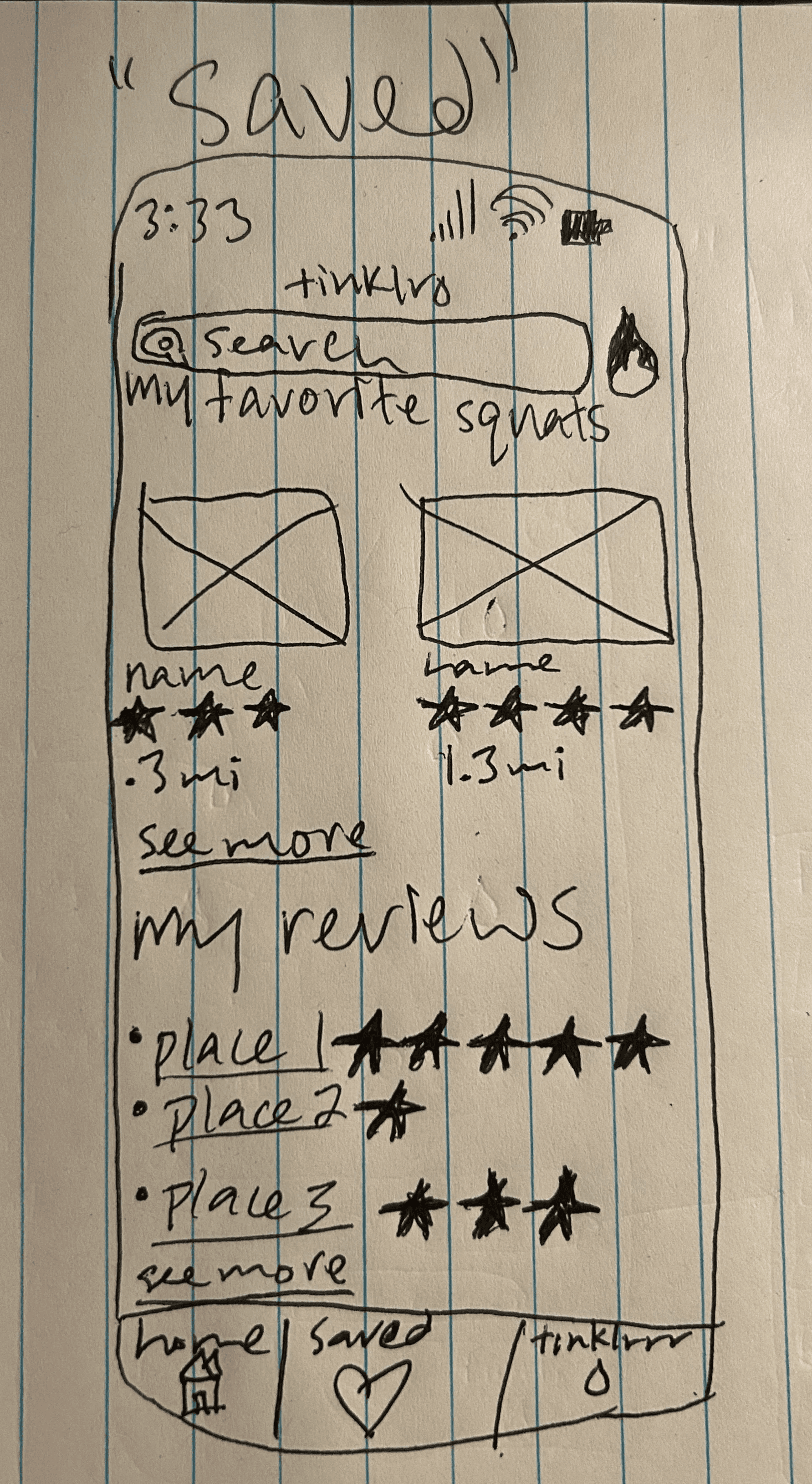
With our features identified and our User Flow established, our group was ready to start our wireframes, starting with pencil and paper sketches. These sketches represented each of our identified features related to our user needs of proximity and quality: the map and filter search on the home screen, user's saved bathrooms and reviews, and our Tinder for bathrooms feature, which I decided to call "Tinklrrr" for the sake of this project.
“Paper” Sketch Wireframes


Below are examples of my team members' sketches which helped influence our final design.
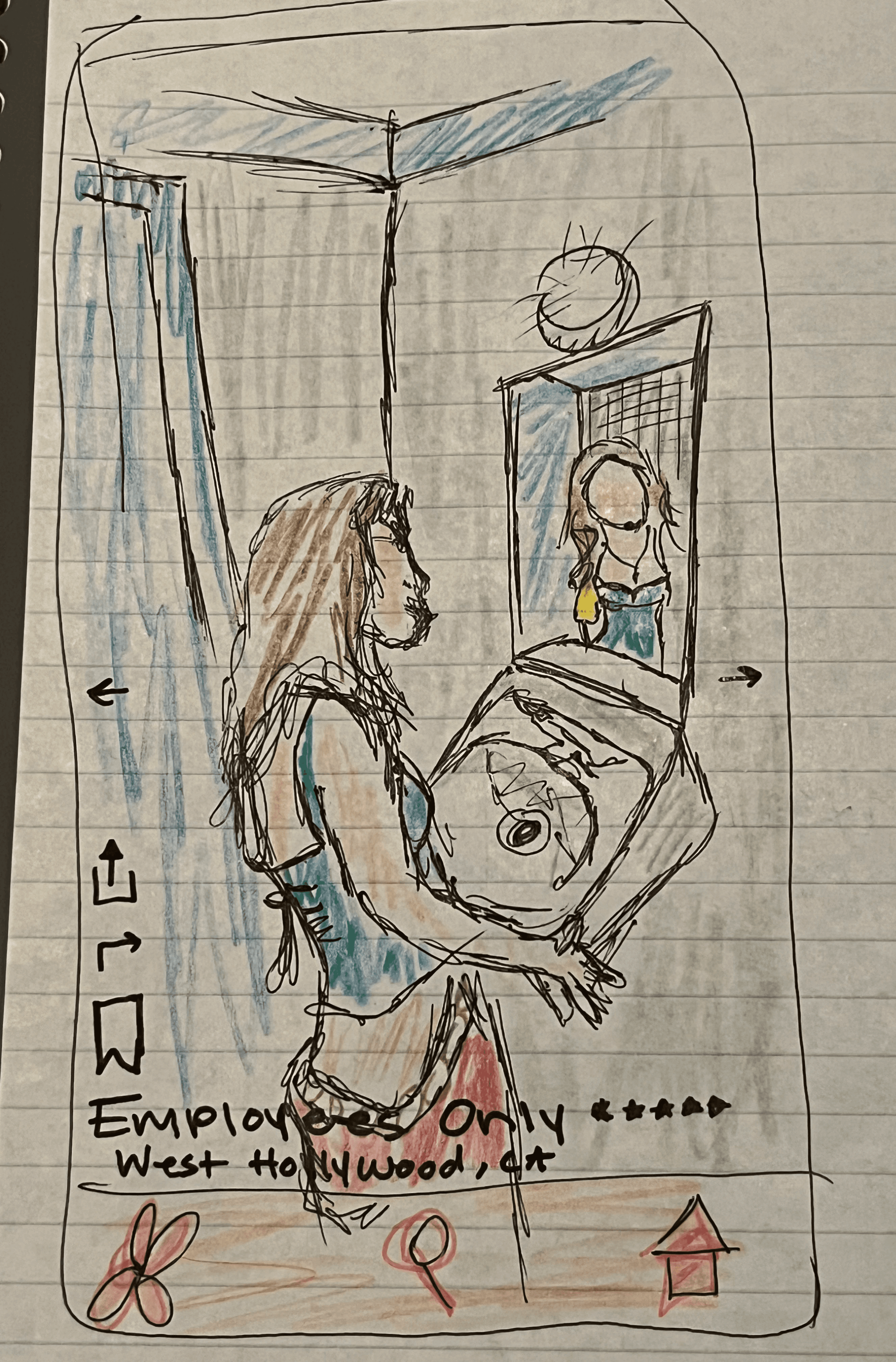


Tinder for bathrooms feature
Home page/Map View
Saved bathrooms/Reviews
After each member finished our initial sketches, we each moved on to our individual low-fidelity wireframes, created using Figma.
Low-Fidelity Wireframes
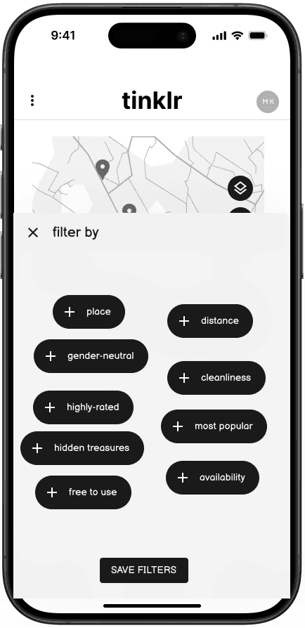
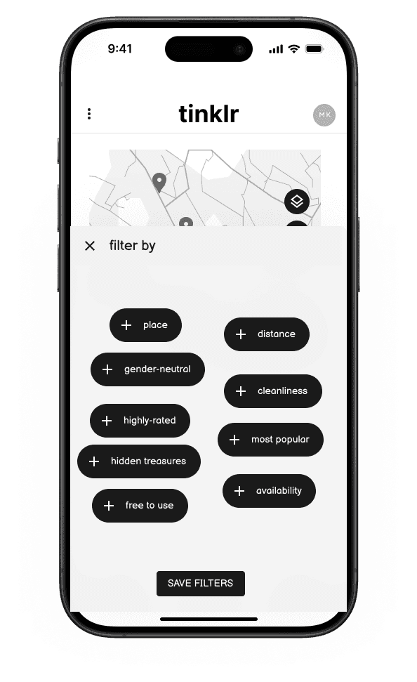
Users can select an option from the top left dropdown menu, or select "nearby", "most popular", or "filter by". For this prototype, I created the filters overlay for users to apply and save filters for a search.

filter by


Save filters
When users select "nearby" from the home page, a list of the closest available public restrooms pop up (named "Place 1", "Place 2", etc. for the sake of the prototype). When clicked, a card with that restroom's information pops up, where the user can select to Read all Reviews for that restroom or save to a list they have created or would like to create.

nearby

Place 1
.2 mi away
★★★★

If a user selects to read all of the reviews for a specific restroom, they are taken to a new page that lists all reviews, as well as the ability to sort or filter the reviews by date, rating, and more.
Read all reviews for Place 1 here

Users can save restrooms to a list using the "save to a list button", where they can then choose from a list they have already created (such as "Favorites"), or they can create a new list using the other button in the pop up window.
save to a list

Choose

Favorites
Users have the ability to change their mind before choosing to save the selected restroom to their list, and they are also notified when a restroom has been saved to a specific list.

SAVE

OKAY
view low-fidelity prototype
05 / Test - Test, Revise, Repeat
Overview
Group Low-fidelity Prototype Tests
Mid-fidelity Prototype Tests
Applying Revisions
High-fidelity Prototype - Final Design
Next Steps
Conclusion and takeaways
Group Low-Fidelity Prototype Tests
Once each group member finished their low-fidelity prototypes, we came back together to test each other's prototypes to give each other feedback and pull the best features of each into the next stage of our collective design.
Approach to Group Testing
Add feedback to group member's square
Add other group member's feedback to individual square
Stamp vote each feature we found the strongest (4 total votes)


Lucia's home/map view
My "filter by"
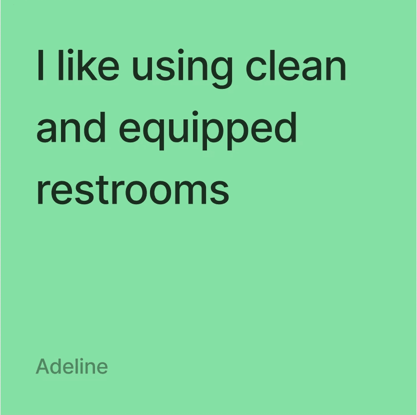
Adeline's swipe feature
Rupali's saved list
Mid-Fidelity Prototype Tests
Each team member evenly split the work to create our mid-fidelity prototype and prepare for a round of user testing. In this prototype, I mostly worked on the home/map view page, created the "filter by" and "save to a list" overlays, and made sure the prototyping on each feature was functional. I also helped with final fine-tuning and helping with decisions or solving a design or functionality problem in Figma.
Once our prototype was ready to test, I got to work writing our user test plan!
Research Objective
Identify pain points associated with using Tinklr. Understand if users find the app efficient and intuitive.
Target Users
The on-the-go adult
Questions We Want Answered
Is Tinklr's navigation intuitive?
Are our features usable?
How do users feel while using Tinklr?
Are users able to navigate our map view and set filters successfully?
Tasks
Ask user to find nearest bathroom
Filter a search for a bathroom
Save a bathroom to a list
Access and explore the Tinklr swipe feature
Results and Suggestions
100% of testers were able to successfully complete three out of the four tasks
Our Home page received mixed feedback: some found it intuitive, some found it confusing to filter a search for a bathroom
Our Tinder for bathrooms swipe feature needed. a lot of coaching to get through
Users overall found the app intuitive and wished it had more functionality
Applying Revisions
From our user testing feedback, we implemented coaching screens at the beginning of our bathroom swiping user flow, updated our tab names to be more intuitive for users, and improved the overall detailing, structuring, and styling of the app.
Tab names
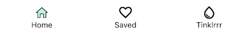

Mid-fidelity
High-fidelity
Tinder swipe feature coaching screens


Final Design
view final prototype
Mid-Fidelity Prototype
In addition to applying the revisions from our user tests on our to mid to high-fidelity prototype, our group updated our overall user flow in this last round of revision. We re-organized the onboarding process to improve the visual flow, added additional steps to clarify the user experience but overall, our original user flow didn't need a lot of editing.
Final User Flow, part 1

Final User Flow, part 2

Map/filter view, part 1


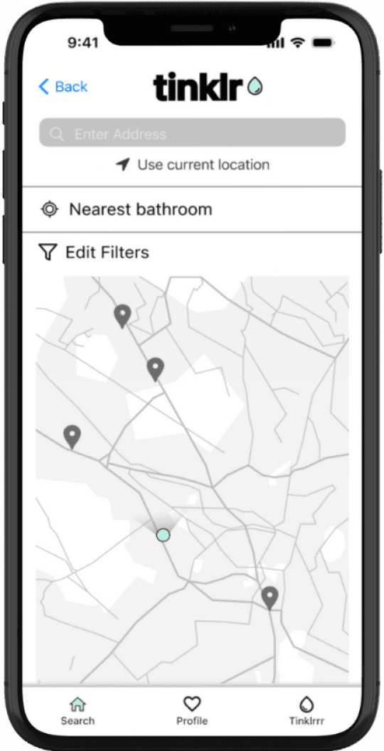
New users are shown the first screen upon first. use. If they choose "Find a bathroom", they are taken to the main map view on the home page. If the user selects the "Edit filters" button, they are shown the options on the third screen
Map/filter view, part 2


Once users click the "save filters" button, they are immediately shown a list of the nearest bathroom that meet their criteria (shown in the second screen). If a user clicks on the "Direct Me" button on the left side of the middle of the screen, the directions begin to navigate the user (shown on the third screen).
Save to "Favorites" list


If a user would like to save a bathroom to a list, they can click "save" on the right side of the middle of the screen, then they are able to select from predetermined lists they have made, or they can choose to create a new list. For this flow, the user has chosen to save to their "Favorites" list.
Map/"nearest bathroom" view

Back to the home screen, if the user selects "Nearest bathroom", a similar overlay pops up, showing the user a summary of the nearest bathroom, without any filters or other user preference.
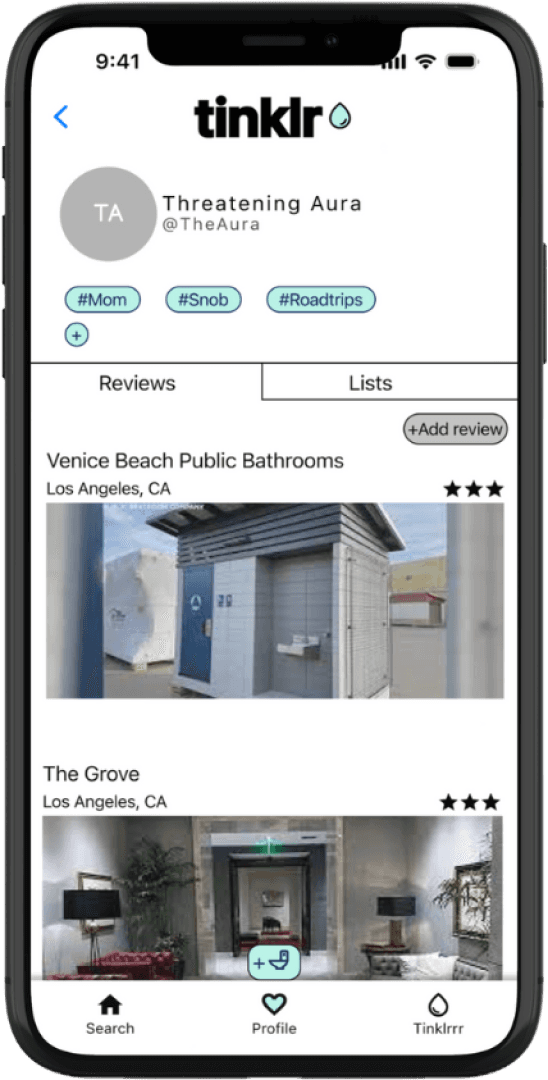
Saved Reviews/Lists


If a user taps the "Profile" tab from the bottom navigation, they can read through the reviews they have previously written under the "Reviews" tab. They can also search through the bathrooms they have saved in their lists under the "Lists" tab.
Submit Review


User experience of leaving a review for a bathroom they have visited. To make the reviewing system less ambiguous, we chose to go with a "thumbs-up, thumbs-down" structure for most of the questions, and left the Cleanliness and Overall Review to a 5-star rating.
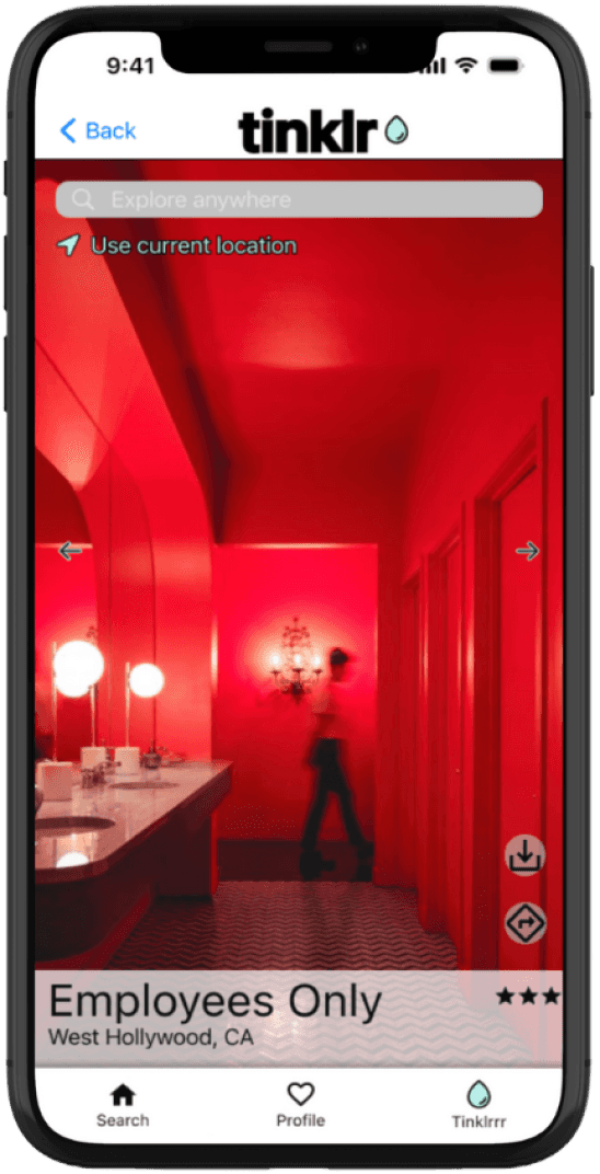
"Tinklrrr" feature

From the home screen (shown first in the first set of wireframes), if the user chooses the "Just Stalling" option, they are taken to our "Tinklrrr" feature, which caters to our users who identify as "bathroom snobs". After allowing location access and reading through the coaching screen, users are shown the closest bathrooms near them that have been previously identified by users as aesthetically pleasing, or especially "Instagrammable". If users find a bathroom they want to save for later, they can select the save option shown on the right side of the screen, and they can instantly be navigated there by selecting the icon below as well.
If we had more time, we would...
Build out Tinklrrr feature more, rename it
Perform more user tests for our high-fidelity prototype
Build out Saved and Reviews features more
Rethink "add review" button placement
Conclusion and Takeaways
The elephant in the (rest)room
Talking about using a public restroom can be an uncomfortable topic for some, but people had a lot of thoughtful, impactful things to say in our surveys and user tests. It can be worth it to engage with a taboo topic, you never know what value it could being to potential users!
Meeting the user where (and when) they gotta go
Our user feedback throughout the process varied, but had consistent themes, which ultimately helped guide and shape the creation of our features to be simple and familiar, but still address a wide range of our user needs and preferences
Collaboration is key
This was the first group project for our bootcamp, and our team ended up working collaboratively on this project, and all of our ideas were made better by leaning on each other as well as user/instructor input when needed.
Have any thoughts or questions about this project?
Let’s discuss!
contact me
Have any thoughts or questions about this project?
Let’s discuss!
contact me
Tinklr
"Know where to go when you gotta go"
Helping users find their perfect public restroom
Overview
ROLE:
UX Designer; team of 4
TIMELINE:
4 weeks - 30+ hours
TOOLS USED:
Figma / Canva / Procreate / Trello
Note: This project is a fictitious scenario, completed as a part of UC Berkeley’s Online Extension UX/UI Design Program. The interviews and user testing were all conducted with real people, however.
Problem
The modern on-the-go adult needs a convenient and accurate way to find clean, private and well-supplied public restrooms because our research shows that a majority of users struggle to find public restrooms that address their specific needs and preferences.
Solution
Tinklr is a mobile application that helps users search for and locate public restrooms that suit their needs.
view final prototype
view final prototype
Project Goal
Design a high-fidelity mobile application that solves a real, everyday problem for users. This project was the first group project of my boot camp.
01 / Empathize - User Research
Research Approach
Our team created a Google survey with 13 questions to assess current pain points and opportunities for the public restroom experience, and whether there is a need for help with locating public restrooms. Myself and one other group member posted the survey on our Instagram stories to collect responses.
Research Problem
Understand if there is a need for help with locating public restrooms.
Research Objectives
Learn about people's current experience finding and using public restrooms
What people look for in a public restroom that makes it more or less desirable to use
Discuss any specific needs that may cause people to seek out a public restroom more (ex: being a parent, having a health condition, etc.)
Demographic Information
Taken from Google Form feedback
Survey Findings
We received a lot of great feedback from our survey. To organize the responses and identify any recurring themes or pain points, we created an Affinity Diagram and an Empathy Map.
"Pains" Highlights
"Gains" Highlights
Top Takeaways
#1 - Proximity: A lot of the feedback we received concerned needing to find a public restroom at a moment's notice, sometimes due to medical conditions, including seizures, IBS, and internal cystitis
#2 - Quality: Half of our survey respondents mentioned cleanliness when looking for a restroom. Many also mentioned a preference for public restrooms that are well-stocked, private, and have pleasing decor. Several people said they only visit certain chain businesses' restrooms because they can depend on the quality and availability, especially when in a rush or in an emergency.
Overview
Research Approach
Survey Findings
02 / Define - Synthesis
Overview
Persona Development
User Insight
Problem Statement
Competitor Analysis
Persona Development
The consistencies our team found among our survey participants proved that there were opportunities for user's experience finding an accessible, reliable public bathroom. Many people enjoy the overall experience of a well-stocked, well-maintained bathroom, and for others, a public restroom can serve as a temporary place of refuge to tend to their children or personal health conditions.
Users also pointed out that some public restrooms also require a key, code, or some sort of purchase to be allowed to use their bathroom. For users experiencing an emergency or needing to tend to a health condition, it could be uncomfortable or even harmful to a person to keep them from being able to access a clean public bathroom when needed. Additionally, some people an be "bathroom snobs", as one survey respondent put it, meaning they have a high standard from public bathrooms, and appreciate when bathrooms go above and beyond when it comes to cleanliness or aesthetics.
From these identified opportunities, we were able to put together our User Persona.
Maria is a mom on-the-go who loves to travel. However, she feels restricted by ensuring she's always within a close range to somewhere she knows probably has a bathroom that's suitable to her and her kids. She cares deeply about the safety of herself, her kids, and her community.
User Insight
The modern on-the-go adult needs a convenient and accurate way to find clean, private, and well-supplied public restrooms because our research shows that a majority of users struggle to find public restrooms that address their specific needs and preferences.
Problem Statement
Finding a public restroom to meet individual standards can be a time-consuming and unpredictable process, from the search to the cleanliness/availability of the restroom. Through user interviews, we have found that the modern on-the-go adult prefers a well-maintained bathroom that is easy and accessible for the public to use.
How might we assist potential users in finding the nearest public restroom that accommodates their needs, preferences, and mobility?
How might we help users figure out their preferences when it comes to the bathroom?
How might we help users communicate with each other and leave feedback about positive/negative experiences in public restrooms or finding public restrooms?
How might we help users locate a more private restroom to use while in public (i.e. family bathrooms, gender-neutral, single stall, accessible, etc.)?
How might we save users time when locating a public restroom?
How might we accommodate groups of people who require a public restroom?
How might we notify users of live conditions of a public restroom near them to determine whether or not they want to use it?
How might we accommodate users looking for an "Instagrammable" bathroom?
Competitor Analysis
Two of my group members handled the task of our competitor analysis. They started with three direct competitors, as in existing apps that helps users locate public restrooms using a map view: Flush, Lulu, and Toilet Finder.
Flush
Features:
Map and list view of public restrooms
Three symbols to denote bathroom characteristics (requires key, requires fee, disability access)
Pros:
Easy, straightforward
Users can add bathrooms to the app and note whether the restroom requires a key, a fee, or has disability access.
Cons:
Map is view only - directions to the bathroom redirect the user to Apple Maps
No filters, no reviews, no ability to save a restroom for later
Only available in the United States
Lulu
Features:
Map view of all public and available private bathrooms nearby
List of bathroom features with icons corresponding to amenities
Private bathroom access for $1-$3 fee and generates temporary bathroom access pass
Pros:
Provides photos of bathroom and exterior building
Has search filters for bathrooms that are "open now" and specify gender
Cons:
No user-generated content or ratings
Only available in New York City
Toilet Finder
Features:
Map view of public restrooms nearby
User-generated content and ratings
Pros:
Users can leave reviews (missing from other two apps)
Gives you directions to closest public bathroom immediately
Cons:
Doesn't list hours or amenities for nearby bathrooms
In addition to direct competitors, my group members also looked at Spothero, an indirect competitor to Tinklr. Spothero is used to locate and pay for parking spots in areas determined by the user using the app's "Search Location" feature.
Spothero
Features:
Users can enter work location and other saved placed to find nearby parking
Thorough, fully accessible map
Pros:
Many filters, personalization options, and visual elements to aid experience
List of amenities is provided per selected parking lot
Cons:
Only shows paid options for parking lots and garages, no free options.
After discussing these competitors as a group, we had a better idea of the opportunities we had to incorporate our user needs into the features of Tinklr.
03 / Ideate - Create the Framework
Overview
Ideation
Storyboarding
User Flow
Ideation
To expand on our thought process and keeping our two main opportunities of Proximity and Quality in mind, our group completed a round of ideation using the “I like, I Wish, What If?” method.
From here, we organized our ideas into a Feature Prioritization Matrix, paying special attention to the ideas that were higher in both priority and feasibility.
Related to our user need of Proximity, we identified features related to a live map search and directions to the nearest restroom that fits the users preferences:
Related to our user need of Quality, we identified features related to user ability to write and read user-generated reviews related to cleanliness, view photos of the bathroom to allow users to make a more informed decision, and search for restrooms that have nicer overall vibes for our "bathroom snobs":
Storyboarding
When it came to storyboarding, one group member thought of Josiah, another potential user of Tinklr, and walked through another possible user scenario.
Created using Figjam.
User Flow
Initial User Flow
This was our group's first user flow. We started by having one group member create individual flows for each of our main features, starting with our map/filter search to address our user need of proximity:
We also created a flow for users to save and write reviews of specific bathrooms they have used, addressing both user needs of proximity and quality:
Our final mini-flow focused on our "Tinder for bathrooms" feature, which allows users to swipe through bathrooms that are more concerned with aesthetics, focused on our user need for quality:
From these flows, our team worked together to form our overall user flow, shown at the top of this section. Below is the user flow broken down for easier viewing:
Part 1
Part 2
04 / Prototype - From Paper Sketches to Figma
Overview
Wireframes
UI and Branding
Wireframes
With our features identified and our User Flow established, our group was ready to start our wireframes, starting with pencil and paper sketches. These sketches represented each of our identified features related to our user needs of proximity and quality: the map and filter search on the home screen, user's saved bathrooms and reviews, and our Tinder for bathrooms feature, which I decided to call "Tinklrrr" for the sake of this project.
“Paper” Sketch Wireframes
Below are examples of my team members' sketches which helped influence our final design.
Tinder for bathrooms feature
Home page/Map View
Saved bathrooms/Reviews
After each member finished our initial sketches, we each moved on to our individual low-fidelity wireframes, created using Figma.
Low-Fidelity Wireframes
Users can select an option from the top left dropdown menu, or select "nearby", "most popular", or "filter by". For this prototype, I created the filters overlay for users to apply and save filters for a search.


When users select "nearby" from the home page, a list of the closest available public restrooms pop up (named "Place 1", "Place 2", etc. for the sake of the prototype). When clicked, a card with that restroom's information pops up, where the user can select to Read all Reviews for that restroom or save to a list they have created or would like to create.
If a user selects to read all of the reviews for a specific restroom, they are taken to a new page that lists all reviews, as well as the ability to sort or filter the reviews by date, rating, and more.
Users can save restrooms to a list using the "save to a list button", where they can then choose from a list they have already created (such as "Favorites"), or they can create a new list using the other button in the pop up window.
Users have the ability to change their mind before choosing to save the selected restroom to their list, and they are also notified when a restroom has been saved to a specific list.
05 / Test - Test, Revise, Repeat
Overview
Group Low-fidelity Prototype Tests
Mid-fidelity Prototype Tests
Applying Revisions
High-fidelity Prototype - Final Design
Next Steps
Conclusion and takeaways
Group Low-Fidelity Prototype Tests
Once each group member finished their low-fidelity prototypes, we came back together to test each other's prototypes to give each other feedback and pull the best features of each into the next stage of our collective design.
Approach to Group Testing
Add feedback to group member's square
Add other group member's feedback to individual square
Stamp vote each feature we found the strongest (4 total votes)
Lucia's home/map view
My "filter by"
Adeline's swipe feature
Rupali's saved list
Mid-Fidelity Prototype Tests
Each team member evenly split the work to create our mid-fidelity prototype and prepare for a round of user testing. In this prototype, I mostly worked on the home/map view page, created the "filter by" and "save to a list" overlays, and made sure the prototyping on each feature was functional. I also helped with final fine-tuning and helping with decisions or solving a design or functionality problem in Figma.
Once our prototype was ready to test, I got to work writing our user test plan!
Research Objective
Identify pain points associated with using Tinklr. Understand if users find the app efficient and intuitive.
Target Users
The on-the-go adult
Questions We Want Answered
Is Tinklr's navigation intuitive?
Are our features usable?
How do users feel while using Tinklr?
Are users able to navigate our map view and set filters successfully?
Tasks
Ask user to find nearest bathroom
Filter a search for a bathroom
Save a bathroom to a list
Access and explore the Tinklr swipe feature
Results and Suggestions
100% of testers were able to successfully complete three out of the four tasks
Our Home page received mixed feedback: some found it intuitive, some found it confusing to filter a search for a bathroom
Our Tinder for bathrooms swipe feature needed. a lot of coaching to get through
Users overall found the app intuitive and wished it had more functionality
Applying Revisions
From our user testing feedback, we implemented coaching screens at the beginning of our bathroom swiping user flow, updated our tab names to be more intuitive for users, and improved the overall detailing, structuring, and styling of the app.
Tab names
Mid-fidelity
High-fidelity
Tinder swipe feature coaching screens
Final Design
view final prototype
view final prototype
Mid-Fidelity Prototype
In addition to applying the revisions from our user tests on our to mid to high-fidelity prototype, our group updated our overall user flow in this last round of revision. We re-organized the onboarding process to improve the visual flow, added additional steps to clarify the user experience but overall, our original user flow didn't need a lot of editing.
Final User Flow, part 1
Final User Flow, part 2
Map/filter view, part 1
New users are shown the first screen upon first. use. If they choose "Find a bathroom", they are taken to the main map view on the home page. If the user selects the "Edit filters" button, they are shown the options on the third screen
Map/filter view, part 2
Once users click the "save filters" button, they are immediately shown a list of the nearest bathroom that meet their criteria (shown in the second screen). If a user clicks on the "Direct Me" button on the left side of the middle of the screen, the directions begin to navigate the user (shown on the third screen).
Save to "Favorites" list
If a user would like to save a bathroom to a list, they can click "save" on the right side of the middle of the screen, then they are able to select from predetermined lists they have made, or they can choose to create a new list. For this flow, the user has chosen to save to their "Favorites" list.
Map/"nearest bathroom" view
Back to the home screen, if the user selects "Nearest bathroom", a similar overlay pops up, showing the user a summary of the nearest bathroom, without any filters or other user preference.
Saved Reviews/Lists
If a user taps the "Profile" tab from the bottom navigation, they can read through the reviews they have previously written under the "Reviews" tab. They can also search through the bathrooms they have saved in their lists under the "Lists" tab.
Submit Review
User experience of leaving a review for a bathroom they have visited. To make the reviewing system less ambiguous, we chose to go with a "thumbs-up, thumbs-down" structure for most of the questions, and left the Cleanliness and Overall Review to a 5-star rating.
"Tinklrrr" feature
From the home screen (shown first in the first set of wireframes), if the user chooses the "Just Stalling" option, they are taken to our "Tinklrrr" feature, which caters to our users who identify as "bathroom snobs". After allowing location access and reading through the coaching screen, users are shown the closest bathrooms near them that have been previously identified by users as aesthetically pleasing, or especially "Instagrammable". If users find a bathroom they want to save for later, they can select the save option shown on the right side of the screen, and they can instantly be navigated there by selecting the icon below as well.
If we had more time, we would...
Build out Tinklrrr feature more, rename it
Perform more user tests for our high-fidelity prototype
Build out Saved and Reviews features more
Rethink "add review" button placement
Conclusion and Takeaways